As promised, I’d like to share some highlights of what I
learned in this class. As the title
says, the class focused on the clothed figure, in line only (Direct Drawing)
instead of focusing on dramatic light and shadow (Chiaroscuro), something I’m
much more comfortable with doing. In art
school, you don’t typically find classes that do this.
What is Direct Drawing?
There are many ways to draw; however, this class focuses on the Direct Drawing method in line only. Every line you put down is a searching line and is part of the finished drawing. This method uses line only (with some flat toning when appropriate) which requires a more precise rendering than if using halftone rendering or shading. It also enables you to draw out a figure quickly, easily and believably in order to communicate an idea. This means that you must train the eye to see the exact shape and draw it with all its subtleties. And a thorough understanding of the structures that are being drawn, how they exist in perspective and connect to other structures of the body are of vital importance. It’s a bit overwhelming at first, but once it all falls into place, it begins to happen naturally.
In Direct Drawing, there’s no under drawing or ghosting in;
therefore, the Drawing Aids, including line quality are of vital importance.
What are the Drawing Aids involved in Direct Drawing? They are:
- Opinion—that thing the artist wants to communicate through the drawing (or painting)
- Line Quality—the expressiveness of line
- Proportion
- Gesture
- Anatomical shapes
- Relationships
- Stretch and Compression
- Wraparounds (a.k.a. ellipses)
- Overlapping forms (a.k.a. form over form)
- Rhythm
- Continuity
In addition to the Drawing Aids, the artist must:
- Learn to edit out (more on this in a future post) unnecessary information and leave in, accentuate those areas that best communicate his/her opinion
- Understand the seven types of folds (discussed in a future post) and use them while communicating his opinion
As I talk about drawings throughout my blogging experience,
I will refer to the above terms quite often, especially those terms that are
still weak for me.
Needless to say, I’m extremely excited about what I’ve
learned and have vowed to do four to seven drawings per week as I review the
entire 15-week course. I want to go back
and work on those weak areas so that by the time the next semester begins, I
will be even closer to rendering a nearly perfect figure, nude and/or clothed!
The basic idea is to train the eye to “see” like an artist. That takes patience and stick-to-itiveness. We
used many of the principles outlined in Barbara Bradley’s book, Drawing People: How to Portray the Clothed Figure! It’s a great book for an artist to have in
his/her library especially if rendering the figure well is something desired.
After three weeks of quick reviews, we began photographing
our own models so that we could learn to control that part of being an
illustrator. All shots had to be what’s
referred to as “dynamic” meaning they had to show some kind of movement in the
gesture. For the fourth week, I
photographed my husband in various golf swings!
The photo shoot was a lot of fun, and he enjoyed himself because playing
golf (or pretending to play, posing for photos) is in his element! We had to choose two pictures to draw. Here are the two images that I choose along
with the drawings I submitted during the fourth week of the semester:


I got a decent grade for a decent attempt, but I wasn’t satisfied! It took the entire week to finish these two drawings! I wasn’t happy about that because that brought on too much stress.
Around the seventh week, we had to submit a midway portfolio of our best work to that point. The second drawing above is one of the images that I posted. Here are a few more…


In the next several weeks, I will go back through all the lessons and drawings, doing a minimum of four drawings per week, until I’ve completed each concept in an attempt to overcome my lingering weaknesses which are folds, anatomical shapes and continuity. I will post my progress, including my new drawings as well as my sketches.


I got a decent grade for a decent attempt, but I wasn’t satisfied! It took the entire week to finish these two drawings! I wasn’t happy about that because that brought on too much stress.
Around the seventh week, we had to submit a midway portfolio of our best work to that point. The second drawing above is one of the images that I posted. Here are a few more…


I struggled with myself for the next six weeks trying to
improve on all the drawing aids, especially my line quality. It wasn’t until about week 10 ½ that I began
to feel like I was finally getting it. Good
thing…because the next week we would be studying extreme perspective! Once I started catching on, I began to relax,
and things began to be fun again! I
finally felt like I was getting a handle on things. But this was only the beginning of getting a
handle.
I still felt that my line quality was lacking…until I reviewed
my old critiques and realized that what I was searching for in line quality was
there all along! The line quality that I
was trying to attain was actually what I already had! I despised my “searching” lines, dismissing
them as messy and dirty while everyone, including the instructor, kept trying
to saying otherwise! I am now trying to
develop those searching lines to a point where I control them better!
Our final assignment was to put together a portfolio
including 12 to 20 of our best drawings, including sketchbook drawings, if we
desired, beginning with week nine along with a written statement. We were free to include drawings from weeks
one through seven, if they showed mastery of the Drawing Aids. I included two from the first half of the
semester and the remaining ones from the second half.
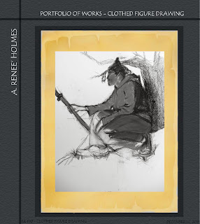
With the exception of one image that's been replaced and three sketchbook drawings, here is my end-of-semester portfolio…


In the next several weeks, I will go back through all the lessons and drawings, doing a minimum of four drawings per week, until I’ve completed each concept in an attempt to overcome my lingering weaknesses which are folds, anatomical shapes and continuity. I will post my progress, including my new drawings as well as my sketches.
Goal: January, 2014
- To complete and post a minimum of four figure studies each week.
- To continue drawing from life in sketchbook, practicing quick sketches focusing on continuity, anatomical shapes and folds.
- To post minimum of seven sketchbook drawings from life and/or practice works each week.
Now that I’ve verbalized it, I will have to stick with
it. Knowing that you guys know my plan
is going to keep me going!
(Idea! Maybe I should
start a blog for my weight loss efforts!
LOL! Just a thought…)


