Saturday, December 29, 2012

FA 616 - PORTRAIT PAINTING


The instructor for this course this fall was a charming lady: Kristan Le. I chose her among a couple of other alternatives because of her stunning portofolio, which you can find here.

The course name is basically what you get: an intensive full immersion in portrait painting projects in oil of increasing difficulty, starting from simple head and shoulder portrait and moving into larger and longer paintings including hands. The first few assignments are given one week of time, but as the course moves it branches into 2-week exercises run in parallel with 4-week assignment projects. In total, there are 9 exercises and 4 assignments (aka 13 paintings) expected from the course, although honestly there is no difference in challenge and complexity between the two types, they just have a different tempo. The expected style is uniformely realistic, which is the standard in commission portraiture. 

My very first portrait for the course - I got a B for this one
As it is normal by now with reference-based online course, we worked from photographs. The interesting part was that after the first few weeks we were allowed to use our own reference, although they needed to get approval first. This was very interesting for two reasons. First, a lot of references were rejected and you quickly learned to be on the watch  for the differences between a good and a bad reference and how to set up your own photoshooting to get usable reference. I do believe this is a fundamental skill in contemporary portraiture and, despite my expereence in photography, I did learn  a lot about what makes a portrait reference successful. The course material is very well assembled in this aspect and really points you in the right direction with regard to lighting, composition, posing, props, color schemes, etc...Second, of course, you get to paint your own paintings, of people you know and who are important to you - and you do invest a lot more energy in a portrait of a dear person than in that of a total stranger. Of course, you could choose to use the sets of references provided by the academy, which were very nice and provided a very ample choice of model types and poses - I saved all of them as they might come in handy for future use. I did use my own reference whenever the option was available.
One of my favorite models provided by the AAU - Andrea


A portrait of a colleague of mine from my own photograph, around week 9 - a big improvement!

The style of painting suggested by the AAU is what I called the "posterizing" alla prima style, which I will describe in more detail in a future post. This is particularly successful for portraiture and I do believe my best works in the course were produced with this approach. There are several video demonstration with the course, about 2 hours per module. I have to admit that I only watched the first few, as they become so repetitive (the style used is uniformly the same) that I found myself systematically drifting away to do something else while they run in the background...which became the background of the background and then 4 windows behind my current and then just a voice murmuring something. The last ones I downloaded I did not even bother to look what they were about-  but there the problem was that I simply did not have any time left to invest 2 h to watch somebody painting - I needed to paint myself!

Similar to two other colleagues from the course, I used several references of children - my children. Boy, it is difficult to paint children. Do  not even attempt it until you feel confident in your painting skills. The easiest is men, as you can paint very loose and you will just get a more masculine feeling. Women are more tricky, as their skin needs to be smoother. Children are a nightmare - every slight mistake in values or transitions makes them look older. In one occasion, I even had the brilliant idea to use a reference I knew to be marred by insufficient value contrast - which meant I had to rely on warm-cool transitions to achieve tridimensionality, which is an even bigger challenge. The result is Spring Giulia - not too bad, considering the circumstances, though you can see how much more effective Winter Giulia is, which has a clear value structure (and a more effective staged composition on top).

Spring Giulia - insufficient value contrast in the reference made this panting very difficult to pull through


Autumn Giulia - I had to change the color of the background midway through. Shows that it always pays to do color sketches beforehand.


Winter Giulia - my last assignment and I believe one of my best paintings of all history. Optimally staged lighting and composition are mandatory for a successful painting


Critiques were thorough and useful - a little slow in coming sometimes, but very detailed and helpful. Some commens I only understood after the next painting or the one after, but this is rather normal when you are growing your skills at such a fast pace. Kristan had a very specific taste (clear forms, simple composition with large shapes, loose brushwork) which does not necessarily overlap with mine, but the discrepancy was not so strong as to cause problems.


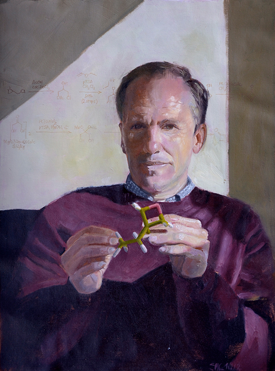
Overall, I found the course very good and with an enormous impact on my painting skills. And I really  like at least 5 of the paintings I produced during it, which is quite a good yield considering how self-critic I tend to be. And I definitely confirmed something I discovered a while ago: I love hands! One day I will make a series of "hand portraits". 

The course concluded with a review of the business and how to market oneself as portraitist. And here I start to wonder: how come I cannot find any reference to commission portraiture in Europe? It is quite common in the US and somewhat in the UK, but no mention of mainland Europe...


Thursday, December 27, 2012

OIL PAINTING FOR BEGINNERS - 1


The two courses I had this fall were both oil painting courses, FA 616 - Portrait Painting and ILL 607- Figure and Environment - what seemed to make sense when I registered was probably a totally foolhardy and naive decision, matured from my total ignorance of what it means to work with oils. And then again, after having managed to do this (this being an average of two paintings a week), the fear of oil and the activation energy to start a painting are gone forever. Indeed, making an oil painting is not that much more of an effort than sketching on the back of a napkin, once you have a routine going that allows you to start and/or finish a painting almost every day. 


One of my first paintings from Situation and Environment
One thing has to be stated before anything else: oils are fabulous. They fit me like a glove: paint handling, intensity of color, flexibility, scope of treatment, open time (i.e. time they stay wet), possibility to test things on the go and always correct for mistakes..it is a dream come true. If you have ever asked yourself why oils are the media of choice of generation after generation of painters since 500 years, ask no more - start using them and all will be clear.  While slowly crawling up the learning curve, I now look forward to a lifetime of playing with the scope and potential of this medium, hopefully getting better along the way. I am not partial to traditional media, but I do believe traditional painting is never going to disappear....and am intrigued by the possibility of mixing it with digital, like Hugo Award winner John Picacio.

One of my first paintings for Portrait Painting


 I decided to share some of the things I learnt in our blog, but I have to put in a disclaimer -  this is MY experience, MY views and opinions and MY personal relationship with oils.  Too many artists pretend to have the world’s wisdom at their feet regarding this medium and I do not want to do the same - I have still so much to learn that it would be ridiculous to do that. So do not expect THE solution, just one of the many possible views and ways.
This discussion will span several entries, and in the first I would like to address some of the common concerns and beliefs many have (me included, until four months ago) about oils which were totally shattered for me during this semester:
  1. Acrylics are no substitute for oils. There is nothing acrylics can do that you cannot do with oils (more on that later), while there is a world of things you can do with oils that acrylic can approach only with a lot of tweaking and wrestling.
  2. Safety. Everybody who refuses to use oils in favor of acrylics seems to be concerned with safety, toxic fumes, odors and the like. I have not invested any serious research in this, but I do believe the most toxic component of oils is the pigments...which are mostly the same in acrylics and watercolors. The oil medium is unlikely to be particularly toxic in this context, unless you decide to eat the colors. Plus, it is not volatile (oils dry by oxidation, not by evaporation). I actually use liquin (also called alkyd), a synthetic medium that dries faster than oil. Some people complain of allergy to liquin, but I luckily have no problem with it and it is reported to be even less of a concern than natural oils. I do not ever use turpentine or other volatile solvents. Not even for washing the brushes (I found out that they can be washed perfectly well with water and LOTS of liquid soap). During paintings, if I need to clean the brushes I use the medium and lots of kitchen paper. For very lean underpaintings, I use a less-toxic equivalent of turpentine which is called OMS (Odorless Mineral Spirit or Odorless White Spirit). I do not know about  the toxicity of this one, but I use so little and so rarely that I doubt it is a concern. My studio does not stink..it actually does not smell of anything. I use an apron and one-way gloves all the time (I know some people do not like one-way gloves, but, hey, I am a chemist... I spent most of my life with latex gloves on...), so I can actually jump out of a painting and tend to my children with no fear of “contaminating” them. Needless to say, my studio is off-limits to both of them. I am sure you can use lots of fancy media mixtures, varnishes and the like and I am equally sure there are troops of artists who swear that the ONE WAY to work with oils is with medium x or medium y or pigments z. Well...in all my limited experience, I do not believe there is something like a “best” way to work with oils. I have scouted the internet for hours and have 50 cm of bookshelf occupied by books on oil painting and the conclusion is: there are lots of great artists and lots of different ways these artists work, each with their own lineup of media, supports and pigments. So, if you do want to work exactly like a specific artist, you probably have to follow their recipe, but if you are just looking for your own way, be assured that you can use oils comfortably without ever smelling a whiff of solvent.
  3. Oil painting is not slow. At least it was not for me. You can pace a painting as fast or as slow as you wish. Of course a 40” painting with multiple figures is going to take a while, especially if you want super smooth rendering, but during the semester, with four paintings a week going, the majority of paintings took no more than 8 hours from start to finish. Add about 2 hours for preparing and drawing and you can easily do a painting a day (or every three days if you paint after working hours, as I do). One week we even did 30’ paintings and 1h paintings and the results are not at all bad: some people actually prefer those to the more polished ones. Here are 30 min and 1h paintings:
30'

30'

1h


Larger projects take longer of course and if you go into glazing and refining stages you can actually go on forever, but the key is: it does not NEED to be that way. It is your choice how long you want to invest in a painting, and you can happily specialize in 1h paintings and do beautifully. For myself, I sort of “evolved” into a way of painting which is either direct (ala prima window-shading, no underpainting) or uses what I call a “poster” underpainting followed by a single second pass. I will give examples of both in a future entry, but both are fairly fast approaches.

This painting took almost exactly 9 h

Using my kitchen as environment!

Portrait "Sargent-style" - about 10 h of work

Wednesday, December 26, 2012

The Other Road Towards a Goal: Another Semester Closer!!

Completion of fall Semester, 2012

Introduction

Since the last time I wrote, I’ve had a couple of frightening episodes that brings to life the fact that life is short and that we must seize the moment and do as we are intended to do.  That intent is most likely the thing that we think about…something we think we’d enjoy doing…long-hidden desire…the thing that would be nice to do.  Deep down, there is a desire, and that “thing” needs to be explored.


The Artists Way, by Julia Cameron is a book that speaks to this idea, the notion of pursuing a passion.  Cameron advocates that if the idea crosses your mind even once, it’s worth exploring.  We deny ourselves the privilege of exploring those ideas because they are usually non-conventional.  They are beyond the traditional. 


I’m no different.  This is the thing that so often holds me back as well yet the desire never leaves.  It grows stronger and stronger as I experience life’s episodes.  I realize that I must take the bull by the horns, so to speak, and dive head first, without fear, into my desires and let my new career take shape.


I’ve completed three semesters towards my Masters of Fine Arts (MFA) in painting.  I’ve decided that my secondary pursuit will be in Illustration so that I can illustrate my daughter’s beautiful poetry as my thesis towards graduation in a few years.  Each semester at AAU has proven to be quite beneficial and productive for me.  I’ve meet several inspiring people with whom I’ve developed great relationships. 


As Cameron mentions in her book, I’ve begun to build my Circle of Influential people.  This circle should include those who inspire us and feed our artistic endeavors not because they tell us what we want to hear but what we need to hear in order to help us grow as artists.  They do not tear us down and crush our artistic dreams.  Of course, we do the same for them. Many of those that I’ve met across the globe are included in that circle.


I’d like to sum up my fall 2012 semester at the Academy of Art University (AAU) by saying this semester proved no different than any other.  I’ve grown as an artist, in skill, knowledge and confidence.  I’m now forcing myself to begin truly working towards the goals I’ve avoided for so long!


FA 602 – Head Drawing

Each semester, I say that a class that I’ve just completed has been the best thing for my artistic career.  But without a doubt, this one has to be among the top of those classes!  I’ve learned so much about drawing the human head.  I cannot really put it into words properly, and going through the class, I notice it wasn’t easy to put it into words.  We had to go through the process, the first seven weeks, in order to appreciate all that we were learning.  By the seventh week, the improvement was so obvious.  For example, take a look at one of my drawings from September 2012 as compared to the same drawing from December 2012, the end of the semester.  Even though I didn’t finish the redo as much as I would’ve liked, it is still much more precise than the first attempt.  Compare them both to the photo of the original bust.

Assignment Two:

December, 2012

September, 2012
Original Bust


Assignment Six:

 
December, 2012

Original
October, 2012


The first one was done in October, 2012.  The redo was in December, 2012.  It’s almost unfair to show this one since it was original done the week that I had major surgery.  But I can honestly say that, aside from it being unfinished (the October version), nothing else differs from what I would have been capable of at the time it was done.  This one, I do believe, is the best example of a major improvement in skill.  The gesture/character of the pose has been captured almost flawlessly.  This particular lean is something I had never been able to accomplish prior to taking the class.  One major key to capturing the pose is in the diagonals.  Despite the subtle problems that exist in the second one, it is obvious that there is a great deal of improvement.


Assignment Seven:

December, 2012

Original
October, 2012

When this one was originally done, in October, we had almost completed all the lessons.  The problem with it is very subtle.  The mouth is drawn in an almost frontal view while the head is ¾ view, and the angle was slightly off.  The right side should have been a little lower.  In my December redo, I adjusted these areas in the mouth and was amazed at how much closer the likeness was.

Assignment 11:


First Submission
Resubmission
 
Originally completed in November, 2012, this is one of the three color assignments we did, and my first real attempt at using pastel.  At this time, all areas of structure had been address.  We were asked to render a pastel “painting” applying all that we had learned about structure.  As expected, there weren’t too many major errors in structure; however, the hat grew as I applied pastel!  I knew that would be addressed in the critique, but I didn’t have time to change it prior to submission.  So, in December, I adjusted and resubmitted it at the appropriate time.  I happy I did because it made a world of difference!

Assignment 12:


Charcoal Under Drawing
Resubmission
First Submission


The objective of assignment 12 was to render a pastel painting in a specific color scheme.  I chose blue analogous split complements.  I chose to make a copy of the original charcoal under-drawing because I thought I had captured every part of the lessons that we learned.  I wanted to keep it to remind myself of that fact once I messed it up with the application of pastel.  I’m glad I did because my first attempt at pastel turned out very badly.  My second attempt had to be redrawn in a hurry because I no longer had a copy of the original under drawing.  I can see glaring errors because it was a rush job.  But my application of pastel was a little better.  Since doing this one, I’ve learned a few things about applying pastel.  The darks should’ve been applied first with application of the lights on top.  I’ll try again on my own time.  I’d like to learn to handle the medium much more accurately and skillfully even though it aggravates my asthma.  I take extra special care when using them.  I used gloves and I wear a mask.  I do not blow the artwork to remove dust and I only wipe up the surrounding areas with a wet cloth so that the dust doesn’t fly in the air.  That seems to work for me in avoiding attacks.


Assignment 14: 

Original Photo
December, 2012

This was one of our final assignments.  We used oil paints for this assignment, except we used them to create the look of a pastel piece.  We were told that this is a method created by Degas because he wanted to create a way to simulate the look and glow of pastel but without the need to cover/protect the piece as you would a pastel painting.  In the application of the oil, a small bit of the structure was thrown off.  The far eye became a bit small. 

ARH
 

Tuesday, December 18, 2012

SEMESTER IS OVER: HOORAY!

So, just a cry of joy for the end of the semester! It has been tough, it has been great, it has been a revelation, it has been a desperation...all you expect and more. With 35 more paintings in my drawers, at least 5 portfolio-worthy pieces, one entry in the Winter Show and two entries in the Fall Show...can you wish for more? I have lots of plans for the intersession, lots of work to be done, lots of administrative stuff to take care of (more submissions, blog, portfolio, websites, etc...), lots of decision taken and many more to take...life is good. Will hopefully be able to talk about it in more detail, as I think some of the things coming up will be very exciting.

So this semester I had FA616-Portrait Painting and ILL607-Situation and Environment. Both great courses, though with plus and minuses, and will deserve separate entries in due time.
In the meantime, enjoy what I believe to be my best painting this semester (by a narrow margin).

Winter Giulia
Oil on linen
30"x 24"


Tuesday, August 28, 2012

ANATOMY AND ME


In case you should be wondering what happened to my self-imposed assignments (I know you are not wondering at all, but let me dream a bit) - I am paused. I admit I have a particularly uninspiring one (collage, hugh!) sitting on my easel since three weeks. In almost exactly one week the semester starts, so I think I will just enjoy another week pause before diving into that kind of hectic....which is of course orders of magnitude above any kind of self-imposed regimen. I am not totally idle, though. I have moved forward with my figure self-study, and I am now fully into anatomy...which is not half as bad as it sounds! I am using several different sources, some of them pretty unusual for artists, so I thought I would share my choice of study books.

My first stop is Bridgman’s “Drawing from life”. At the beginning I thought this book was plain ugly, but now I really appreciate the amount of detail he goes into in explaining every single portion of the body, at rest, from various angles and in movement. There must be at least 100 pages only on the arms! The sketches are really essential and therefore very fast to copy (which is the only way to learn anatomy in my eyes, really).


Loomis’ “Figure Drawing” is much more essential but has some really nice schemes - and the drawings are much clearer than Bridgman’s at times.


Burne Hogart’s books (“Dynamic Anatomy”  and “Dynamic Figure Drawing”) are a world on itself. You cannot really use them in alignment with the other approaches, but I find they complement the other two authors by offering a different perspective and process. I am not using them a lot at the moment, but I know I will go back to them again and again when it comes to real world challenges.


An essential aid for me is not a book but an App - the incredibly wonderful VisibleBody app for the iPad2. It allows you to view the skeleton and each single muscle from any angle, highlight it, name it, remove it, put it back again, see how it attaches to the bones, etc, etc, etc.... It is designed for medical doctors and students of medicine, not for artists, but I find it invaluable in really understanding what sentences like “The biceps long head extends from the glenoid cavity (under acromion) through a groove in head of humerus, the  short head from the coracoid process to the radius” actually mean. I cannot recommend it enough, it is worth every cent of the 30 dollars price tag. 


And finally, a little treasure I discovered by chance: “The Muscle Guide” by Frederic Delavier. This is a book for body builders, but the illustrations are just incredible. It is the only book that really shows the muscles in action, with pseudophotographic accuracy. You see what happens when muscle contract under weight, when the limbs go into extreme positions, or upon stretching. It is full of unique details (for example a comparison of the male and female pelvis bone, down to the different tilt in standing pose - which explains why women always have a little belly, regardless how much they exercise).


Monday, August 6, 2012

ON SKETCHING


Semester is over, life is good: I have started a new sketchbook today. I am not an accomplished artist or illustrator, so probably nobody cares, but I thought I would share some personal thoughts on sketching nonetheless. 

I have always sketched, mostly on loose sheets, but I started keeping sketchbook(s) since about two years - and it has turned into a self-indulgent and regular habit, like smoking. I generally have two running - a big one for a serious job and a pocket-sized one for the quick drawing in-between. I also sketch on notebooks and the back of printouts when I am supposed to listen to whoever is holding a seminar, but that is another story. It took me a while to get over this maniac and misguided idea that sketchbooks have to look nice. Forget about all the examples out there that show you fantastic A3 spreads with awe-inspiring drawings - sometimes in color. My sketchbooks look ugly. They are and full of unfinished drawings, careless notes, unreadable thumbnails and my daughter’s scribbles. They are a cross between diary, shopping list, scrap paper and...well...sketchbooks. To realize that this is ok was an important step forward for me. I often have only five or ten minutes time to sketch, sometimes with my daughter chatting in between and my son trying to eat the wheels of the push-chair in the meantime, so if things had to look nice I would never sketch at all.
Of course there are nice drawings in there and a lot of great visual notes and ideas in thumbnail or study form, but the overall impression is careless and disorganized. And still, while I have read a zillion art books, my sketchbooks are the most inspiring and didactic collection of information in paper form that I own - actually most of the books I read only start to make sense after I have experimented on my sketchbook whatever they are trying to teach.
So, to my new sketchbook. For my standard, it is a luxurious volume. I bought it in Bookbinders Design on sale - still ludicrously expensive with 50% discount. Apple green and almost square, opens to about 60 cm width of ivory white paper with a wonderful silky texture (my last one was very rough, so this is a welcome change). The quality of the binding allows me to draw across the gutter (that is why I never buy ring-bound sketchbooks). The paper is just thick enough to avoid seeing the drawing on the back (I have never understood how people can draw on Moleskine paper, where you see the three previous drawings through the ultra-thin pages!).
As usual, the first sketch is always of my children - with some inspiring text to remind me of my luck and responsibility in having them. This time I also sketched on the return information page.


My absolute favorite sketching instrument is not a pencil proper - it is a Caran d’Ache Luminance colored pencil No 009 (Black). This tip comes from one of the old Loomis’ books, where he suggested that a black colored pencil (I do not remember the make) is a good choice for sketching because it does not smear. This was one of those little golden nuggets that may easily go unnoticed. For me it was a revelation. I went to an art shop and tried all black colored pencils they had until I found one that really did not smear. After working with this for a while, I have to say it is far superior to graphite pencils for sketching and I will probably never use a standard pencil again on a sketchbook. It has many advantages:
  • It is permanent and lightfast
  • It really does not smear (minimally, if you really insist), which is a must for the conditions under which I normally sketch (see above)
  • Has very little wear. I can go through a whole page and still have a reasonable point at the end
  • The point does not break when it falls (again, a must under my sketching conditions)
  • It is soft enough to leave a mark with minimal or no pressure
  • It gives an almost full value range, up to near black
  • Even if you fill the tooth of the paper completely, it will not reflect light like graphite does
Such a perfect instrument has of course a little fault...you cannot erase! But who has the time to erase while sketching? Erasing is for finished pieces or underdrawings, not for sketching! And carrying a kneadable eraser around is a such a messy undertaking anyhow! To be honest, I think it could be erased with the right tool, but as I only use kneadable erasers I have never tried.
I also sketch in ink and washes at times, for which I found my perfect tool in Rotring’s ArtPens, with their standard water-soluble black ink, and a water brush (a pen with a brush instead of a tip and a water reservoir behind - a very simple and clever device).
I sketch everywhere. Actually my family probably hates the moment when I take out my sketchbook - they know I will get stuck where I am for a while. I love sketching people, particularly faces, and I do it at any occasion, but I also sketch in museums, conference halls, coffee shops, tram stops, playgrounds, in the middle of the road...whenever anything catches my attention and I have enough time to stop and jot it down. And if there truly isn't anything interesting, I sketch from imagination. It is really an addiction! One day I might take part in the sketchbook project. Check it out, it is a truly great idea.