In the 18th and 19th Century, it was common practice during the study of Arts in European Academies to copy masterpieces of other artists as part of the learning experience. The Louvre museum even issued special permissions to selected students, who were allowed to set up easel and work in the museum rooms. Just think of getting into a museum today with your easel, palette, turpentine and tubes of color and set up shop in front of – say – a Rembrandt painting. You would probably get arrested…
Anyhow, I have a couple of such “copying” assignments in my assignment box, directed mainly at pastel work. For this one, I set out to copy one of Mary Cassatt’s wonderful mother-and-child paintings, called “Sleepy Baby”, painted in 1910. I did it exactly as big as the original, 20.5 x 25.5 inches on Rives paper – though of course I worked from a photo and I have no idea which paper Mary used.

From the technical perspective, I faced a number of difficulties. One major one was to match the colors of the painting. I do not have enough Sennelier pastels to go even close to the wished colors and even my 96 NuPastel set fell short – plus Mary evidently used softer pastel. I tried my best, but you can see clear differences anyhow. According to Mr Maughan, she probably used blue or sanguine pastel rather than charcoal to do the drawing and either did not tone the paper or used a very light tone. I used blue pastel for drawing, but I do think that Mary used charcoal: there are black lines visible in a couple of places. The color I chose for the toning was definitely wrong – on working on the piece I realized Mary probably toned either with a very light cold blue or with different colors in different areas. I think the latter is the approach I will follow in my next own pastel work, after establishing the value structure in charcoal.
Here is the process shots:
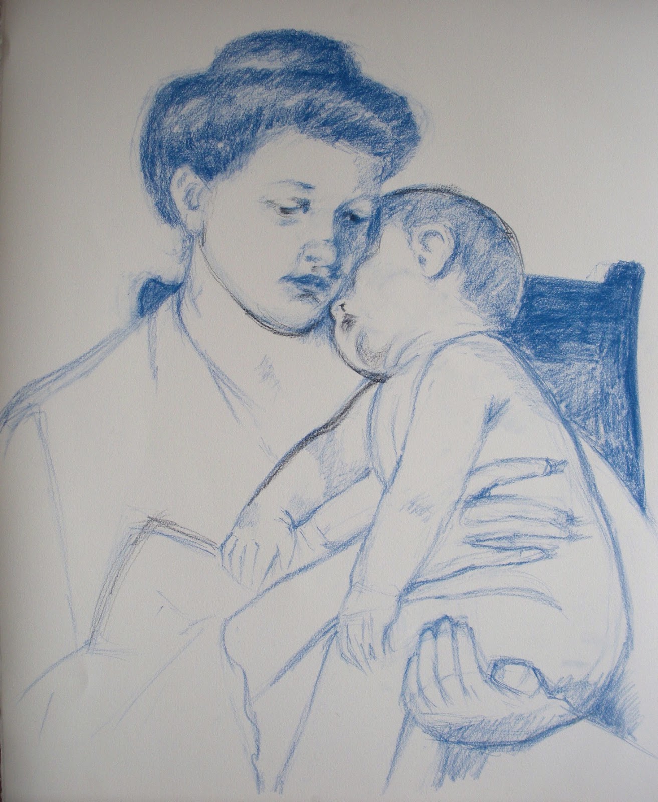


And the final together with the original. They are not fully identical: I swore to cut a finger of my left hand every time I trace (just joking...), so I always draw freehand. Of course it is possible to get identical copies also with freehand drawing, but it takes time and I thought it was not the point here. Needless to say, Mary's is better.
 |
| This is mine |
|
| This is Mary's |
When you copy a work of art is for the purpose of learning – so what did I learn? A few things:
- The original has no hard edges anywhere. The center of focus is achieved by contrast and detail. The drawing is quite detailed and fine around the faces but it gets progressively rougher the farther from the faces it gets;
- Mary was an impressionist. The richness of color in the shadows is what attracted me to the piece in the first place and it was a pleasure to follow through in the rich blues and reds. I liked very much the contrast between the warmish light and the cold bluish shadows.
- The painting is extraordinaly high-key. I ended up using full white for big areas to get the same luminosity, shading it ever so slightly with yellow or blue.
- The softness and delicacy in the rendering of the flesh tones and volumes is wonderful in this work – something really worth learning;
- The work follows the Windmill principle. Here is the key: 1. Dark on light; 2. Light on light; 3. Light on dark; 4. Dark on dark

No comments:
Post a Comment