Tuesday, June 19, 2012

HEAD DRAWING - FA 602

The other studio course I followed this spring is a Fine Arts course: Head Drawing, with the famous William Maughan. I have found mention of his course and his book - "The Artist's Complete Guide to Drawing the Head" throughout the internet, generally with enthusiastic praise - which I can now confirm to be well deserved. As it was the case last semester with the Chiaroscuro course, the principles he teaches are very simple to grasp....and very hard to apply. In essence the key is to concentrate on the shapes of the shadows, their size and relative positions. Forget about features, forget about outlines, just get the shape and size and position of the shadows right and you will get the gender, age, race and likeness of the sitter. The second key learning is edge treatment. Paying a lot of attention to which edges should be hard and which should be soft, which are well defined and which are "lost" to value similarity boosts drawing technique to a totally different level. 
When you have small children, you suddenly notice how many small children are in the world around you. Your surroundings suddenly seem to teem with children, whom you had never noticed before. In the same way, when you finally understand a key concept you see it written everywhere: even in books that you have read already twice without ever noticing it. This happened to me with edge treatment. It is a key concept for analyzing artwork and for creating effective composition and now that I know what is meant with it I find it everywhere.

We used sanguine and white pastel on toned paper for the drawings. Carbothello 645 is the one he recommends: I used Faber Castell 192 at the beginning, but I ended up ordering Carbothello through the internet because it is way softer than Faber Castell. Any middle value paper is ok with this combination - if you want to go darker it takes a darker paper, as mentioned in a previous post. It takes some time to get used to the capped value range (sanguine simply does not go as dark as charcoal!), but the results are really nice and elegant.


This technique is very close to painting, and indeed he carried me through to my first real "painting" experience, using pastels as a medium.  He was also the one to introduce the Sennelier pastels for painting, which have a wonderful soft consistence and are well worth their price. Now that I am using them also for private work I am seriously considering to order a bigger range of colors, although they cost about 5 dollars each in this part of the world - for the moment I am complementing my modest set with NuPastel and Rembrandt pastel. Last but not least he introduced the technique known as "painture a l'essence" - which led me to squeeze my very first oil tubes onto a palette! I cannot say I liked the experience but it was a good way to loose the respect for the oils somehow.


Peinture a l'essence


That is basically the essence of the course...and yet, it has had a tremendous impact on my drawing skills. First of all, my heads now look like the people I am trying to draw: a very satisfying achievement. Second, this technique is actually applicable to any subject with the same effect - you get a drawing that is closer to a painting than to a cartoon. 

Tuesday, June 12, 2012

DIGITAL FEATURES


I am not proud of this week's results...actually I think they are plain awful. But, as Ira Glass said, this is a normal part of learning and I will not hide it. The brief called for doing a digital painting tutorial of my choice. I chose to do human features according to the wonderful tutorials published by 3D total in their great "Digital Painting Techniques" books. The tutorials I picked are from Anne Pagoda and Nykolai Aleksander, two great digital artists (particularly the latter). Why do I want to do such things? Together with self-imposed assignments I have a number of self-imposed goals. One of them reads something like:

"Thou shall master all media"

It is not that I expect to be able to really master all media but I do want to feel halfway comfortable in all of them. My style (whatever that may be) should be dominated by content not by media. And digital painting is a medium, nothing more, nothing less - and a very powerful one on top. There are actually people out there doing work so awesome with the computer that you feel like you will need three lifes to ever get even close to their level. Check this summary:


So here they are: eyes, mouths, ears and noses - not really like they were intended in the tutorials, I am afraid. I am used to draw with the tablet in Photoshop and that is ok...but painting is another matter altogether. It seems I am nowhere close to understand how the brushes work, there are way too many options to adjust: it feels like you have to change settings every two seconds to get where you want. Towards the end I had the feeling it is almost like learning to use the airbrush (which I have never learnt to use properly, tough I can do decent work) - it is just a matter of coordinating flow, pressure and sweep. Probably not a lot more complex than learning to drive a car or ride a bike....so here is my first fall from that bike. I think there will be many more before I will manage to handle this.


Thursday, June 7, 2012

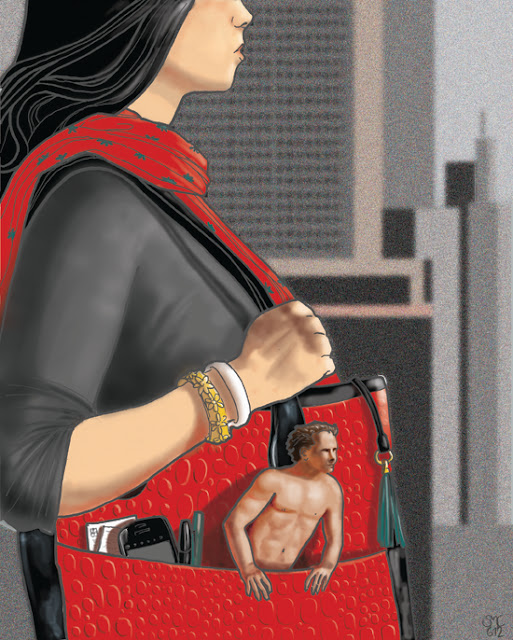
THE PORTABLE MAN

I struggled a lot with this piece and it was incredibly frustrating. It was intended as a first experiment in digital photo-collage, but after three hours of work I realized I would never get where I wanted with the photos I had. While I was thinking when and where to schedule another photo session, I said to myself: I want to be an illustrator, not a photographer - so draw the stupid thing. Up to the initial sketch all went fine, then I had the brilliant idea to experiment with vectors...Ok, I realize it is not impossible to learn how to deal with them, but after the first attempts I estimated this would take the best part of my next five to ten studio slots. I know this is important and I will have to learn it at some point, but maybe that is not what I want to do right now. So I re-rasterized everything and went on from that.
It did not turn out as planned, although I do not dislike it...and I still like the concept, so maybe I will do another version one day. 
The big blank area is intended for lettering - I want to use this as an imaginary book cover for an imaginary book which somebody should bother to write entitled: "Managing Men: A Guide for Women".

The Portable Man - Digital

Friday, June 1, 2012

ETHNIC HEAD STUDIES

The brief for this self-imposed assignment read: "At least four monochromatic studies of ethnic heads (inuit, aborigine, maori, etc..). Dry media on toned paper." I cannot use them for portfolio or anything because I do not own the reference photos, but I hope it will be forgiven if I post them only once here. These studies are A4 sized and very fast to do, about 1h each or less. As soon as I started looking for reference I realized the scope of this training exercise: age, sex, race, expression, characterization....One could go on for a lifetime!


Classical sanguine and white pastel. Raatiraore (on the left) from Tahiti is one of the people interviewed in the fantastic book "Six Billion Others", which I warmly recommend to anyone interested in faces, people or the human race in general. The text below is an extract from his interview.


This are experiments with dark grey and white PanPastel. I liked the result, especially in the rendering of fur, so I did two of them.
   

These two ladies from Haiti did not really fit the brief (I know there is another assignment in the box that would fit them better), but I liked their expression. I do not think they turned out very well, especially because both had a difficult lighting and the color of the paper is wrong. I was taught that with monochromatic drawing on toned paper, the value of the paper should be halfway between your darkest dark and your lightest light. In both of these the paper is too light for the color scheme used.