Showing posts with label Pastel. Show all posts

Wednesday, December 26, 2012

The Other Road Towards a Goal: Another Semester Closer!!

Completion of fall Semester, 2012

Introduction

Since the last time I wrote, I’ve had a couple of frightening episodes that brings to life the fact that life is short and that we must seize the moment and do as we are intended to do.  That intent is most likely the thing that we think about…something we think we’d enjoy doing…long-hidden desire…the thing that would be nice to do.  Deep down, there is a desire, and that “thing” needs to be explored.


The Artists Way, by Julia Cameron is a book that speaks to this idea, the notion of pursuing a passion.  Cameron advocates that if the idea crosses your mind even once, it’s worth exploring.  We deny ourselves the privilege of exploring those ideas because they are usually non-conventional.  They are beyond the traditional. 


I’m no different.  This is the thing that so often holds me back as well yet the desire never leaves.  It grows stronger and stronger as I experience life’s episodes.  I realize that I must take the bull by the horns, so to speak, and dive head first, without fear, into my desires and let my new career take shape.


I’ve completed three semesters towards my Masters of Fine Arts (MFA) in painting.  I’ve decided that my secondary pursuit will be in Illustration so that I can illustrate my daughter’s beautiful poetry as my thesis towards graduation in a few years.  Each semester at AAU has proven to be quite beneficial and productive for me.  I’ve meet several inspiring people with whom I’ve developed great relationships. 


As Cameron mentions in her book, I’ve begun to build my Circle of Influential people.  This circle should include those who inspire us and feed our artistic endeavors not because they tell us what we want to hear but what we need to hear in order to help us grow as artists.  They do not tear us down and crush our artistic dreams.  Of course, we do the same for them. Many of those that I’ve met across the globe are included in that circle.


I’d like to sum up my fall 2012 semester at the Academy of Art University (AAU) by saying this semester proved no different than any other.  I’ve grown as an artist, in skill, knowledge and confidence.  I’m now forcing myself to begin truly working towards the goals I’ve avoided for so long!


FA 602 – Head Drawing

Each semester, I say that a class that I’ve just completed has been the best thing for my artistic career.  But without a doubt, this one has to be among the top of those classes!  I’ve learned so much about drawing the human head.  I cannot really put it into words properly, and going through the class, I notice it wasn’t easy to put it into words.  We had to go through the process, the first seven weeks, in order to appreciate all that we were learning.  By the seventh week, the improvement was so obvious.  For example, take a look at one of my drawings from September 2012 as compared to the same drawing from December 2012, the end of the semester.  Even though I didn’t finish the redo as much as I would’ve liked, it is still much more precise than the first attempt.  Compare them both to the photo of the original bust.

Assignment Two:

December, 2012

September, 2012
Original Bust


Assignment Six:

 
December, 2012

Original
October, 2012


The first one was done in October, 2012.  The redo was in December, 2012.  It’s almost unfair to show this one since it was original done the week that I had major surgery.  But I can honestly say that, aside from it being unfinished (the October version), nothing else differs from what I would have been capable of at the time it was done.  This one, I do believe, is the best example of a major improvement in skill.  The gesture/character of the pose has been captured almost flawlessly.  This particular lean is something I had never been able to accomplish prior to taking the class.  One major key to capturing the pose is in the diagonals.  Despite the subtle problems that exist in the second one, it is obvious that there is a great deal of improvement.


Assignment Seven:

December, 2012

Original
October, 2012

When this one was originally done, in October, we had almost completed all the lessons.  The problem with it is very subtle.  The mouth is drawn in an almost frontal view while the head is ¾ view, and the angle was slightly off.  The right side should have been a little lower.  In my December redo, I adjusted these areas in the mouth and was amazed at how much closer the likeness was.

Assignment 11:


First Submission
Resubmission
 
Originally completed in November, 2012, this is one of the three color assignments we did, and my first real attempt at using pastel.  At this time, all areas of structure had been address.  We were asked to render a pastel “painting” applying all that we had learned about structure.  As expected, there weren’t too many major errors in structure; however, the hat grew as I applied pastel!  I knew that would be addressed in the critique, but I didn’t have time to change it prior to submission.  So, in December, I adjusted and resubmitted it at the appropriate time.  I happy I did because it made a world of difference!

Assignment 12:


Charcoal Under Drawing
Resubmission
First Submission


The objective of assignment 12 was to render a pastel painting in a specific color scheme.  I chose blue analogous split complements.  I chose to make a copy of the original charcoal under-drawing because I thought I had captured every part of the lessons that we learned.  I wanted to keep it to remind myself of that fact once I messed it up with the application of pastel.  I’m glad I did because my first attempt at pastel turned out very badly.  My second attempt had to be redrawn in a hurry because I no longer had a copy of the original under drawing.  I can see glaring errors because it was a rush job.  But my application of pastel was a little better.  Since doing this one, I’ve learned a few things about applying pastel.  The darks should’ve been applied first with application of the lights on top.  I’ll try again on my own time.  I’d like to learn to handle the medium much more accurately and skillfully even though it aggravates my asthma.  I take extra special care when using them.  I used gloves and I wear a mask.  I do not blow the artwork to remove dust and I only wipe up the surrounding areas with a wet cloth so that the dust doesn’t fly in the air.  That seems to work for me in avoiding attacks.


Assignment 14: 

Original Photo
December, 2012

This was one of our final assignments.  We used oil paints for this assignment, except we used them to create the look of a pastel piece.  We were told that this is a method created by Degas because he wanted to create a way to simulate the look and glow of pastel but without the need to cover/protect the piece as you would a pastel painting.  In the application of the oil, a small bit of the structure was thrown off.  The far eye became a bit small. 

ARH
 

Friday, August 3, 2012

ICARUS 2.0


This piece is for my second GLA assigment of the semester, the topic is “Technoscapes”. The assay that accompanies it addresses the risks and opportunities of virtual reality, modern neuroscience and the research for immortality. 
I really liked the idea and the title - I find it very evocative. I convinced my brother to pose for the figures, which gave me some fantastic photographic reference to work with.
Still, I am not so convinced about the result. I think I overdid the color once again. And I struggled once more with a stupid technical problem: how do mixed-media artists transfer their intermediate steps in traditional media into the computer to continue working in digital? Do they all have rotary scanners? Do they have fully equipped photographic studios? Do they only work in format A3? I am at a loss. The photos I get are definitely not good enough. This time I had it scanned professionally but the quality of the scan was miserable and I had to tweak the curves in Photoshop for one hour before starting.
In summary, I did the figures and the background in pastel in A1 format (to have sufficient width for the spread of the arms). Then scanned it in, fought with the levels and saturation, then added the background (a picture of the connectome) in overlay mode. I fought with the levels a bit more, adjusted brightness here and there, desaturated part of the background. I then added the mesh on the winged figure (overlay with some outer glow) and a little bit of glow around the head. Well, that’s it. Sometimes it is just not a “Uau”.


Update: This illustration was actually selected for the Fall Show at the AAU/Society of Illustrators...so it is probably not as bad as I think!

Tuesday, July 31, 2012

PRIVATE RENAISSANCE


This was by far the most complex and time-consuming piece I have ever done. Part of the problem was that I only had less than 2 hours of studio time per day in the past weeks (sometimes no studio time at all), so the whole thing stretched for almost a month and, as I guess is normal in such cases, it lost a bit of momentum. If I had had 10 hours per day to work on it it would not have been more than a week's work.
Isabella in the Kingdom of Love by Lorenzo Costa, 1504-1506
Originally, it was just supposed to be a study of drapery from a drawing featuring Isabella d’Este (a copy from a painting by Lorenzo Costa the Elder called “Isabella d’Este in the Kingdom of Love” - an allegory of Isabella’s coronation. I have never seen the original, although it is in the Louvre - I only had a relatively ugly drawing to work with). I had so much fun drawing that (and modifying the ugly face and hands of the original), that I went on and made another study of a Florentine woman of the same period from the same book (a history of costume). I put the two drawings one beside the other...and suddenly it seemed they belonged together and deserved a background as well. So I joined the sheets, collected reference of arcs, roses, gardens, a bas-relief from a church in Angers, etc... and gave them a context. 


The charcoal under-drawing looked good enough to go on, so I made a digital color study. At this point I wanted a quietly controlled, high renaissance flavor, so I browsed through a book about Raphael and aimed for the same limited color palette and feeling of diffused light. I built the picture in shades and tones of red and yellow only (some shades of green, purple and orange were thrown in as well), starting with the background, then the arch, then the faces. 

Digital color study
Work in progress, with all references laid out

I have a book about wrought iron-work that I collected from a public bookshelf, so I used some reference from that to build a iron gate behind the figures (I used the tracer for that). The figures were built last, so that I could pay attention to all edges.
The finished work with a digitally added background
Although it has cost me much more work that I anticipated, I am very happy with the result, especially if I compare the faces of the original with the ones I painted - without reference! Drapery is a fancy of mine, so I really enjoyed doing that and I think it turned out fine: velvet and linen and gold are quite believable. I also like the composition, although it seems maybe to lack a focus.


The original thoughts about the title were about a “Secret Garden”, “The Garden of the Heart” or something along those lines. Towards the end I realized it could make a perfect cover for a wonderful book by Maria Bellonci that I read a while ago: “Rinascimento Privato” - literally “Private Renaissance”. It is half historical novel, half documentary book and is written in the first person by the voice of ...Isabella d’Este! It could not be more fitting...just dreaming up a bit. This piece will definitely make it into my budding portfolio.
It is about time it was finished: I now have only five days left for my second GLA assignment  - for which I could secure the perfect model!

Sunday, July 1, 2012

MARY CASSATT: "SLEEPY BABY"


In the 18th and 19th Century, it was common practice during the study of Arts in European Academies to copy masterpieces of other artists as part of the learning experience. The Louvre museum even issued special permissions to selected students, who were allowed to set up easel and work in the museum rooms. Just think of getting into a museum today with your easel, palette, turpentine and tubes of color and set up shop in front of – say – a Rembrandt painting. You would probably get arrested…
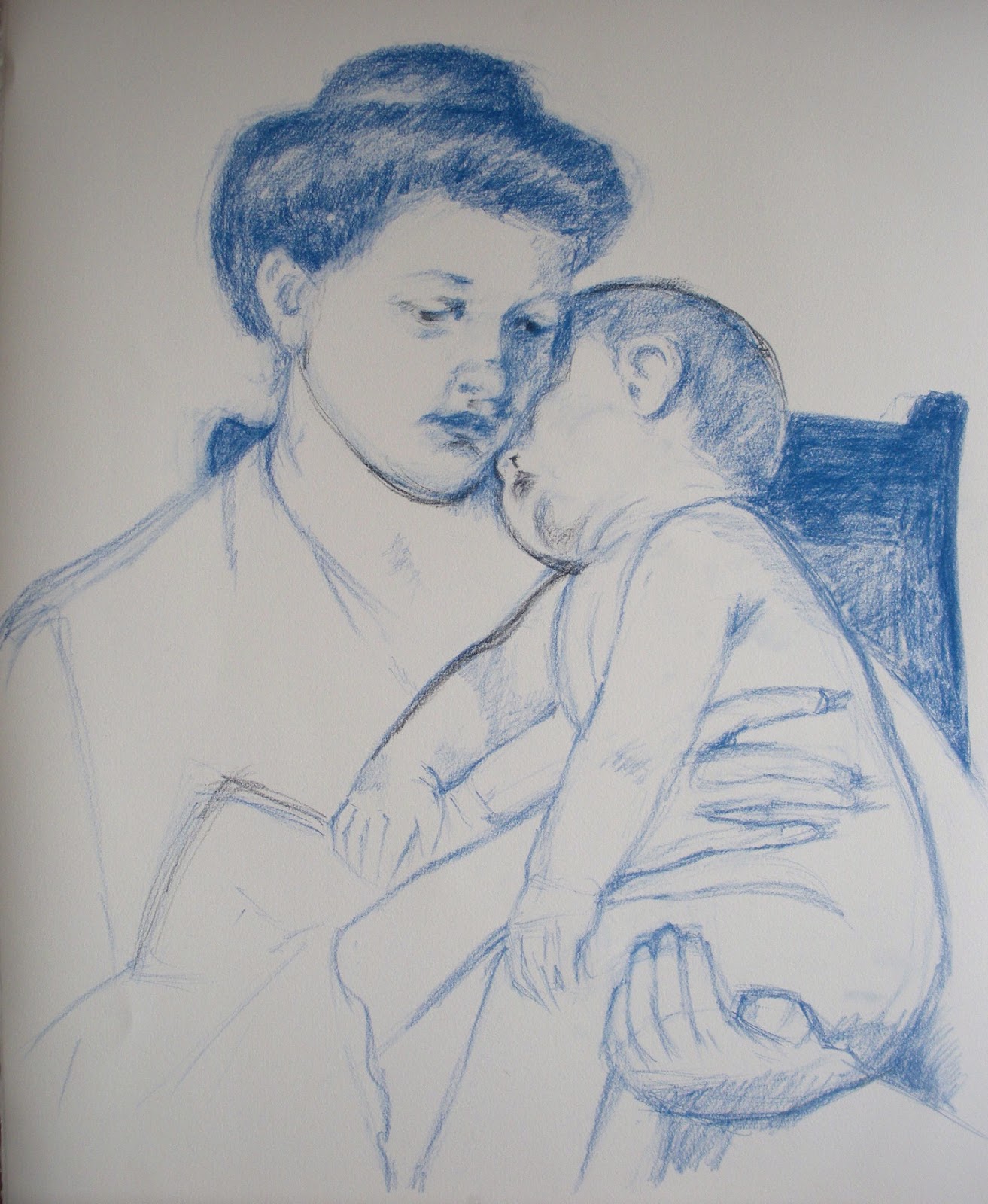
Anyhow, I have a couple of such “copying” assignments in my assignment box, directed mainly at pastel work. For this one, I set out to copy one of Mary Cassatt’s wonderful mother-and-child paintings, called “Sleepy Baby”, painted in 1910. I did it exactly as big as the original, 20.5 x 25.5 inches on Rives paper – though of course I worked from a photo and I have no idea which paper Mary used.

From the technical perspective, I faced a number of difficulties. One major one was to match the colors of the painting. I do not have enough Sennelier pastels to go even close to the wished colors and even my 96 NuPastel set fell short – plus Mary evidently used softer pastel. I tried my best, but you can see clear differences anyhow. According to Mr Maughan, she probably used blue or sanguine pastel rather than charcoal to do the drawing and either did not tone the paper or used a very light tone.  I used blue pastel for drawing, but I do think that Mary used charcoal: there are black lines visible in a couple of places. The color I chose for the toning was definitely wrong – on working on the piece I realized Mary probably toned either with a very light cold blue or with different colors in different areas. I think the latter is the approach I will follow in my next own pastel work, after establishing the value structure in charcoal.
Here is the process shots:


And the final together with the original. They are not fully identical: I swore to cut a finger of my left hand every time I trace (just joking...), so I always draw freehand. Of course it is possible to get identical copies also with freehand drawing, but it takes time and I thought it was not the point here. Needless to say, Mary's is better.
This is mine


This is Mary's 


When you copy a work of art is for the purpose of learning – so what did I learn? A few things:
  • The original has no hard edges anywhere. The center of focus is achieved by contrast and detail. The drawing is quite detailed and fine around the faces but it gets progressively rougher the farther from the faces it gets;
  • Mary was an impressionist. The richness of color in the shadows is what attracted me to the piece in the first place and it was a pleasure to follow through in the rich blues and reds. I liked very much the contrast between the warmish light and the cold bluish shadows.
  • The painting is extraordinaly high-key. I ended up using full white for big areas to get the same luminosity, shading it ever so slightly with yellow or blue.
  • The softness and delicacy in the rendering of the flesh tones and volumes is wonderful in this work – something really worth learning;
  • The work follows the Windmill principle. Here is the key: 1. Dark on light; 2. Light on light; 3. Light on dark; 4. Dark on dark


Tuesday, June 19, 2012

HEAD DRAWING - FA 602

The other studio course I followed this spring is a Fine Arts course: Head Drawing, with the famous William Maughan. I have found mention of his course and his book - "The Artist's Complete Guide to Drawing the Head" throughout the internet, generally with enthusiastic praise - which I can now confirm to be well deserved. As it was the case last semester with the Chiaroscuro course, the principles he teaches are very simple to grasp....and very hard to apply. In essence the key is to concentrate on the shapes of the shadows, their size and relative positions. Forget about features, forget about outlines, just get the shape and size and position of the shadows right and you will get the gender, age, race and likeness of the sitter. The second key learning is edge treatment. Paying a lot of attention to which edges should be hard and which should be soft, which are well defined and which are "lost" to value similarity boosts drawing technique to a totally different level. 
When you have small children, you suddenly notice how many small children are in the world around you. Your surroundings suddenly seem to teem with children, whom you had never noticed before. In the same way, when you finally understand a key concept you see it written everywhere: even in books that you have read already twice without ever noticing it. This happened to me with edge treatment. It is a key concept for analyzing artwork and for creating effective composition and now that I know what is meant with it I find it everywhere.

We used sanguine and white pastel on toned paper for the drawings. Carbothello 645 is the one he recommends: I used Faber Castell 192 at the beginning, but I ended up ordering Carbothello through the internet because it is way softer than Faber Castell. Any middle value paper is ok with this combination - if you want to go darker it takes a darker paper, as mentioned in a previous post. It takes some time to get used to the capped value range (sanguine simply does not go as dark as charcoal!), but the results are really nice and elegant.


This technique is very close to painting, and indeed he carried me through to my first real "painting" experience, using pastels as a medium.  He was also the one to introduce the Sennelier pastels for painting, which have a wonderful soft consistence and are well worth their price. Now that I am using them also for private work I am seriously considering to order a bigger range of colors, although they cost about 5 dollars each in this part of the world - for the moment I am complementing my modest set with NuPastel and Rembrandt pastel. Last but not least he introduced the technique known as "painture a l'essence" - which led me to squeeze my very first oil tubes onto a palette! I cannot say I liked the experience but it was a good way to loose the respect for the oils somehow.


Peinture a l'essence


That is basically the essence of the course...and yet, it has had a tremendous impact on my drawing skills. First of all, my heads now look like the people I am trying to draw: a very satisfying achievement. Second, this technique is actually applicable to any subject with the same effect - you get a drawing that is closer to a painting than to a cartoon. 

Tuesday, May 29, 2012

THE LITTLE BLUE BOAT

I have a little tin box full of self-imposed assignment descriptions - a medicine to keep momentum during the intersession! So there will be a steady trickle of posts of the most interesting ones - in the hope of some critique from the world out there. 
I had a single photo taken with my mobile camera of Nicolas sleeping in the grass on his yellow baby sling. What I liked about it was the high chroma shadows and the effects of transmitted light through the fabric, as well as the warm-cold contrasts. I thought it would make a great case study for transmitted light and chromatic reflected light. The composition also looked potentially interesting.


I made a small thumbnail first to study the value pattern and decide the edge treatment. The whole thing looked somewhat too horizontal, even for a quiet subject as this one, so I made two minuscule abstract studies and decided to make the patches of dabbled sunlight on the grass more diagonal (option 2).


I came to love pastels during the semester, and at the moment it is definitely the medium I know best, so that was the choice. I used Rives BFK paper with NuPastel, Rembrandt Pastel and the wonderfully soft but incredibly expensive Sennelier Pastels. I struggled with the color scheme a lot. I have learned that there cannot be three primaries in the same picture...the reference however looked like it had definitely some blue in the shadows on the left side, which together with the yellow and red of the right side would break the rule. Rules are there to be broken, but maybe not when you are just learning to deal with color! Much analysis later, I decided to experiment with Gurney's gamuts and picked one spanning  a high chroma red, medium chroma green and low chroma purple-red  - there are enough yellows in that one to handle the yellow fabric. Gamuts are devised for mixable media, but well, it is just a guideline. I recokened I could build the cool shadows from the purple red and the greens.So for the process, here is the charcoal underdrawing, fixed and toned (I forgot to take a picture before toning!)


Here is the first "wash" of pastel - a terrible stage when you start wondering wether the picture will work out at all...


And I think it did work out. I am quite happy with the result. The chromatic shadows and transmitted light worked out fine. The hands and folds around the head were intended as the focal point. I managed to defocus the legs and the background, I am not too sure about the bright lit fold on top. I fought with the legs a lot and I think they turned a bit muddy..maybe it was not a good idea to exclude the blues from the palette. There is one blue element, of course - guessed which one? 


The Little Blue Boat
Pastel on paper - 40x60cm (16.5"x25.5")


Pastel in my hands always seem to come out with this rich texture and gaudy brilliance that reminds me of a huge ice-cream cup with tons of smarties, cookies, cream and chocolate sauce. Maybe it is a bit too garish, but well, I will learn to tune it down one day - or maybe not! And did I mention I love drapery?