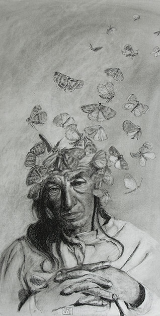
The other studio course I followed this spring is a Fine Arts course: Head Drawing, with the famous
William Maughan. I have found mention of his course and his book - "The Artist's Complete Guide to Drawing the Head" throughout the internet, generally with enthusiastic praise - which I can now confirm to be well deserved. As it was the case last semester with the Chiaroscuro course, the principles he teaches are very simple to grasp....and very hard to apply. In essence the key is to concentrate on the shapes of the shadows, their size and relative positions. Forget about features, forget about outlines, just get the shape and size and position of the shadows right and you will get the gender, age, race and likeness of the sitter. The second key learning is edge treatment. Paying a lot of attention to which edges should be hard and which should be soft, which are well defined and which are "lost" to value similarity boosts drawing technique to a totally different level.
When you have small children, you suddenly notice how many small children are in the world around you. Your surroundings suddenly seem to teem with children, whom you had never noticed before. In the same way, when you finally understand a key concept you see it written everywhere: even in books that you have read already twice without ever noticing it. This happened to me with edge treatment. It is a key concept for analyzing artwork and for creating effective composition and now that I know what is meant with it I find it everywhere.


We used sanguine and white pastel on toned paper for the drawings. Carbothello 645 is the one he recommends: I used Faber Castell 192 at the beginning, but I ended up ordering Carbothello through the internet because it is way softer than Faber Castell. Any middle value paper is ok with this combination - if you want to go darker it takes a darker paper, as mentioned in a previous post. It takes some time to get used to the capped value range (sanguine simply does not go as dark as charcoal!), but the results are really nice and elegant.


This technique is very close to painting, and indeed he carried me through to my first real "painting" experience, using pastels as a medium. He was also the one to introduce the Sennelier pastels for painting, which have a wonderful soft consistence and are well worth their price. Now that I am using them also for private work I am seriously considering to order a bigger range of colors, although they cost about 5 dollars each in this part of the world - for the moment I am complementing my modest set with NuPastel and Rembrandt pastel. Last but not least he introduced the technique known as "painture a l'essence" - which led me to squeeze my very first oil tubes onto a palette! I cannot say I liked the experience but it was a good way to loose the respect for the oils somehow.
 |
| Peinture a l'essence |
That is basically the essence of the course...and yet, it has had a tremendous impact on my drawing skills. First of all, my heads now look like the people I am trying to draw: a very satisfying achievement. Second, this technique is actually applicable to any subject with the same effect - you get a drawing that is closer to a painting than to a cartoon.