Showing posts with label portrait. Show all posts

Saturday, December 29, 2012

FA 616 - PORTRAIT PAINTING


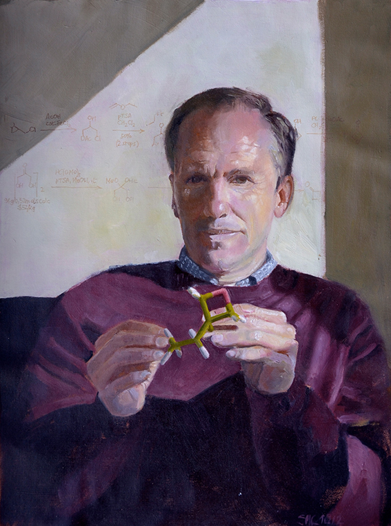
The instructor for this course this fall was a charming lady: Kristan Le. I chose her among a couple of other alternatives because of her stunning portofolio, which you can find here.

The course name is basically what you get: an intensive full immersion in portrait painting projects in oil of increasing difficulty, starting from simple head and shoulder portrait and moving into larger and longer paintings including hands. The first few assignments are given one week of time, but as the course moves it branches into 2-week exercises run in parallel with 4-week assignment projects. In total, there are 9 exercises and 4 assignments (aka 13 paintings) expected from the course, although honestly there is no difference in challenge and complexity between the two types, they just have a different tempo. The expected style is uniformely realistic, which is the standard in commission portraiture. 

My very first portrait for the course - I got a B for this one
As it is normal by now with reference-based online course, we worked from photographs. The interesting part was that after the first few weeks we were allowed to use our own reference, although they needed to get approval first. This was very interesting for two reasons. First, a lot of references were rejected and you quickly learned to be on the watch  for the differences between a good and a bad reference and how to set up your own photoshooting to get usable reference. I do believe this is a fundamental skill in contemporary portraiture and, despite my expereence in photography, I did learn  a lot about what makes a portrait reference successful. The course material is very well assembled in this aspect and really points you in the right direction with regard to lighting, composition, posing, props, color schemes, etc...Second, of course, you get to paint your own paintings, of people you know and who are important to you - and you do invest a lot more energy in a portrait of a dear person than in that of a total stranger. Of course, you could choose to use the sets of references provided by the academy, which were very nice and provided a very ample choice of model types and poses - I saved all of them as they might come in handy for future use. I did use my own reference whenever the option was available.
One of my favorite models provided by the AAU - Andrea


A portrait of a colleague of mine from my own photograph, around week 9 - a big improvement!

The style of painting suggested by the AAU is what I called the "posterizing" alla prima style, which I will describe in more detail in a future post. This is particularly successful for portraiture and I do believe my best works in the course were produced with this approach. There are several video demonstration with the course, about 2 hours per module. I have to admit that I only watched the first few, as they become so repetitive (the style used is uniformly the same) that I found myself systematically drifting away to do something else while they run in the background...which became the background of the background and then 4 windows behind my current and then just a voice murmuring something. The last ones I downloaded I did not even bother to look what they were about-  but there the problem was that I simply did not have any time left to invest 2 h to watch somebody painting - I needed to paint myself!

Similar to two other colleagues from the course, I used several references of children - my children. Boy, it is difficult to paint children. Do  not even attempt it until you feel confident in your painting skills. The easiest is men, as you can paint very loose and you will just get a more masculine feeling. Women are more tricky, as their skin needs to be smoother. Children are a nightmare - every slight mistake in values or transitions makes them look older. In one occasion, I even had the brilliant idea to use a reference I knew to be marred by insufficient value contrast - which meant I had to rely on warm-cool transitions to achieve tridimensionality, which is an even bigger challenge. The result is Spring Giulia - not too bad, considering the circumstances, though you can see how much more effective Winter Giulia is, which has a clear value structure (and a more effective staged composition on top).

Spring Giulia - insufficient value contrast in the reference made this panting very difficult to pull through


Autumn Giulia - I had to change the color of the background midway through. Shows that it always pays to do color sketches beforehand.


Winter Giulia - my last assignment and I believe one of my best paintings of all history. Optimally staged lighting and composition are mandatory for a successful painting


Critiques were thorough and useful - a little slow in coming sometimes, but very detailed and helpful. Some commens I only understood after the next painting or the one after, but this is rather normal when you are growing your skills at such a fast pace. Kristan had a very specific taste (clear forms, simple composition with large shapes, loose brushwork) which does not necessarily overlap with mine, but the discrepancy was not so strong as to cause problems.


Overall, I found the course very good and with an enormous impact on my painting skills. And I really  like at least 5 of the paintings I produced during it, which is quite a good yield considering how self-critic I tend to be. And I definitely confirmed something I discovered a while ago: I love hands! One day I will make a series of "hand portraits". 

The course concluded with a review of the business and how to market oneself as portraitist. And here I start to wonder: how come I cannot find any reference to commission portraiture in Europe? It is quite common in the US and somewhat in the UK, but no mention of mainland Europe...


Wednesday, December 26, 2012

The Other Road Towards a Goal: Another Semester Closer!!

Completion of fall Semester, 2012

Introduction

Since the last time I wrote, I’ve had a couple of frightening episodes that brings to life the fact that life is short and that we must seize the moment and do as we are intended to do.  That intent is most likely the thing that we think about…something we think we’d enjoy doing…long-hidden desire…the thing that would be nice to do.  Deep down, there is a desire, and that “thing” needs to be explored.


The Artists Way, by Julia Cameron is a book that speaks to this idea, the notion of pursuing a passion.  Cameron advocates that if the idea crosses your mind even once, it’s worth exploring.  We deny ourselves the privilege of exploring those ideas because they are usually non-conventional.  They are beyond the traditional. 


I’m no different.  This is the thing that so often holds me back as well yet the desire never leaves.  It grows stronger and stronger as I experience life’s episodes.  I realize that I must take the bull by the horns, so to speak, and dive head first, without fear, into my desires and let my new career take shape.


I’ve completed three semesters towards my Masters of Fine Arts (MFA) in painting.  I’ve decided that my secondary pursuit will be in Illustration so that I can illustrate my daughter’s beautiful poetry as my thesis towards graduation in a few years.  Each semester at AAU has proven to be quite beneficial and productive for me.  I’ve meet several inspiring people with whom I’ve developed great relationships. 


As Cameron mentions in her book, I’ve begun to build my Circle of Influential people.  This circle should include those who inspire us and feed our artistic endeavors not because they tell us what we want to hear but what we need to hear in order to help us grow as artists.  They do not tear us down and crush our artistic dreams.  Of course, we do the same for them. Many of those that I’ve met across the globe are included in that circle.


I’d like to sum up my fall 2012 semester at the Academy of Art University (AAU) by saying this semester proved no different than any other.  I’ve grown as an artist, in skill, knowledge and confidence.  I’m now forcing myself to begin truly working towards the goals I’ve avoided for so long!


FA 602 – Head Drawing

Each semester, I say that a class that I’ve just completed has been the best thing for my artistic career.  But without a doubt, this one has to be among the top of those classes!  I’ve learned so much about drawing the human head.  I cannot really put it into words properly, and going through the class, I notice it wasn’t easy to put it into words.  We had to go through the process, the first seven weeks, in order to appreciate all that we were learning.  By the seventh week, the improvement was so obvious.  For example, take a look at one of my drawings from September 2012 as compared to the same drawing from December 2012, the end of the semester.  Even though I didn’t finish the redo as much as I would’ve liked, it is still much more precise than the first attempt.  Compare them both to the photo of the original bust.

Assignment Two:

December, 2012

September, 2012
Original Bust


Assignment Six:

 
December, 2012

Original
October, 2012


The first one was done in October, 2012.  The redo was in December, 2012.  It’s almost unfair to show this one since it was original done the week that I had major surgery.  But I can honestly say that, aside from it being unfinished (the October version), nothing else differs from what I would have been capable of at the time it was done.  This one, I do believe, is the best example of a major improvement in skill.  The gesture/character of the pose has been captured almost flawlessly.  This particular lean is something I had never been able to accomplish prior to taking the class.  One major key to capturing the pose is in the diagonals.  Despite the subtle problems that exist in the second one, it is obvious that there is a great deal of improvement.


Assignment Seven:

December, 2012

Original
October, 2012

When this one was originally done, in October, we had almost completed all the lessons.  The problem with it is very subtle.  The mouth is drawn in an almost frontal view while the head is ¾ view, and the angle was slightly off.  The right side should have been a little lower.  In my December redo, I adjusted these areas in the mouth and was amazed at how much closer the likeness was.

Assignment 11:


First Submission
Resubmission
 
Originally completed in November, 2012, this is one of the three color assignments we did, and my first real attempt at using pastel.  At this time, all areas of structure had been address.  We were asked to render a pastel “painting” applying all that we had learned about structure.  As expected, there weren’t too many major errors in structure; however, the hat grew as I applied pastel!  I knew that would be addressed in the critique, but I didn’t have time to change it prior to submission.  So, in December, I adjusted and resubmitted it at the appropriate time.  I happy I did because it made a world of difference!

Assignment 12:


Charcoal Under Drawing
Resubmission
First Submission


The objective of assignment 12 was to render a pastel painting in a specific color scheme.  I chose blue analogous split complements.  I chose to make a copy of the original charcoal under-drawing because I thought I had captured every part of the lessons that we learned.  I wanted to keep it to remind myself of that fact once I messed it up with the application of pastel.  I’m glad I did because my first attempt at pastel turned out very badly.  My second attempt had to be redrawn in a hurry because I no longer had a copy of the original under drawing.  I can see glaring errors because it was a rush job.  But my application of pastel was a little better.  Since doing this one, I’ve learned a few things about applying pastel.  The darks should’ve been applied first with application of the lights on top.  I’ll try again on my own time.  I’d like to learn to handle the medium much more accurately and skillfully even though it aggravates my asthma.  I take extra special care when using them.  I used gloves and I wear a mask.  I do not blow the artwork to remove dust and I only wipe up the surrounding areas with a wet cloth so that the dust doesn’t fly in the air.  That seems to work for me in avoiding attacks.


Assignment 14: 

Original Photo
December, 2012

This was one of our final assignments.  We used oil paints for this assignment, except we used them to create the look of a pastel piece.  We were told that this is a method created by Degas because he wanted to create a way to simulate the look and glow of pastel but without the need to cover/protect the piece as you would a pastel painting.  In the application of the oil, a small bit of the structure was thrown off.  The far eye became a bit small. 

ARH
 

Friday, July 6, 2012

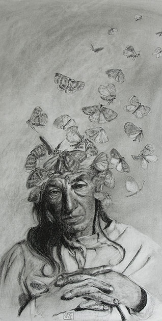
AUGUSTE DETER - A PORTRAIT OF ALZHEIMER DISEASE

Auguste Deter was 55 years old when she died in 1906 in an institute for mentally ill in Frankfurt. Alois Alzheimer, who had been her doctor there, examined her brain after her death, discovering the typical fibrils, plaques and tangles as well as brain atrophy, that have become to be regarded as the clearest diagnostic sign of Alzheimer's disease. These findings were not new, but for a coincidence of events, the already well-described disease became to be known with the name of Auguste's doctor, and her name will be forever remembered as the first person diagnosed with Alzheimer's disease, although this is actually not true: she was merely the youngest.
I find the idea of loosing one's identity and memory the most terrible nightmare that could occur in a person's life. Auguste had found the perfect description for that: "I have lost myself" she said repeatedly. These words and the haunting photograph of her in the year of her death have triggered an image in my head and I had to get it out. I had just got to know the work of the artist Dragan Bibin, so maybe the moths came from that corner of my memory. 

It's a study in charcoal on standard charcoal paper (a bit too rough for my taste, but I have 25 sheet of it, so I should use it somehow). Maybe one day I will make a painting of it. 

Sunday, July 1, 2012

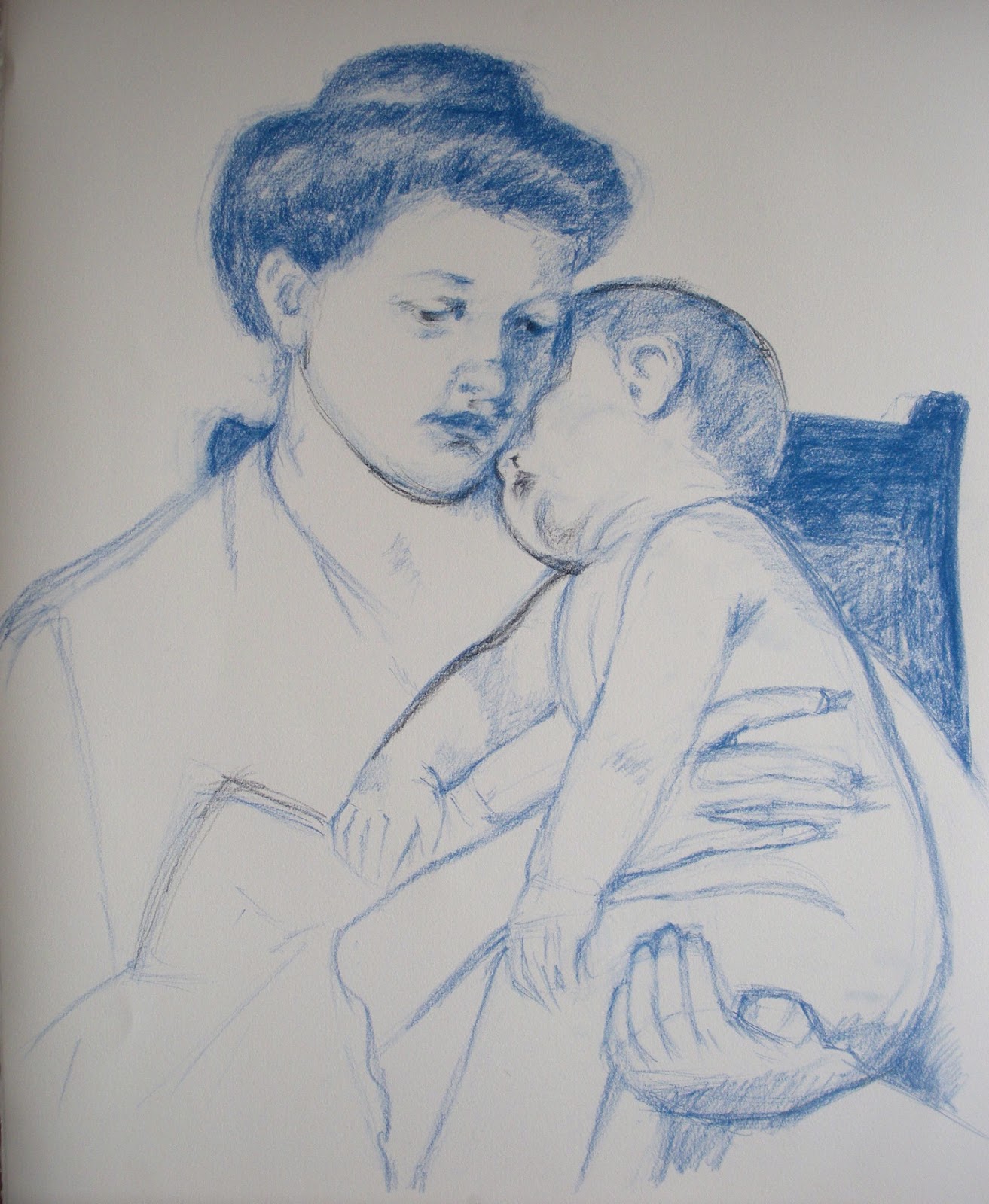
MARY CASSATT: "SLEEPY BABY"


In the 18th and 19th Century, it was common practice during the study of Arts in European Academies to copy masterpieces of other artists as part of the learning experience. The Louvre museum even issued special permissions to selected students, who were allowed to set up easel and work in the museum rooms. Just think of getting into a museum today with your easel, palette, turpentine and tubes of color and set up shop in front of – say – a Rembrandt painting. You would probably get arrested…
Anyhow, I have a couple of such “copying” assignments in my assignment box, directed mainly at pastel work. For this one, I set out to copy one of Mary Cassatt’s wonderful mother-and-child paintings, called “Sleepy Baby”, painted in 1910. I did it exactly as big as the original, 20.5 x 25.5 inches on Rives paper – though of course I worked from a photo and I have no idea which paper Mary used.

From the technical perspective, I faced a number of difficulties. One major one was to match the colors of the painting. I do not have enough Sennelier pastels to go even close to the wished colors and even my 96 NuPastel set fell short – plus Mary evidently used softer pastel. I tried my best, but you can see clear differences anyhow. According to Mr Maughan, she probably used blue or sanguine pastel rather than charcoal to do the drawing and either did not tone the paper or used a very light tone.  I used blue pastel for drawing, but I do think that Mary used charcoal: there are black lines visible in a couple of places. The color I chose for the toning was definitely wrong – on working on the piece I realized Mary probably toned either with a very light cold blue or with different colors in different areas. I think the latter is the approach I will follow in my next own pastel work, after establishing the value structure in charcoal.
Here is the process shots:


And the final together with the original. They are not fully identical: I swore to cut a finger of my left hand every time I trace (just joking...), so I always draw freehand. Of course it is possible to get identical copies also with freehand drawing, but it takes time and I thought it was not the point here. Needless to say, Mary's is better.
This is mine


This is Mary's 


When you copy a work of art is for the purpose of learning – so what did I learn? A few things:
  • The original has no hard edges anywhere. The center of focus is achieved by contrast and detail. The drawing is quite detailed and fine around the faces but it gets progressively rougher the farther from the faces it gets;
  • Mary was an impressionist. The richness of color in the shadows is what attracted me to the piece in the first place and it was a pleasure to follow through in the rich blues and reds. I liked very much the contrast between the warmish light and the cold bluish shadows.
  • The painting is extraordinaly high-key. I ended up using full white for big areas to get the same luminosity, shading it ever so slightly with yellow or blue.
  • The softness and delicacy in the rendering of the flesh tones and volumes is wonderful in this work – something really worth learning;
  • The work follows the Windmill principle. Here is the key: 1. Dark on light; 2. Light on light; 3. Light on dark; 4. Dark on dark


Tuesday, June 19, 2012

HEAD DRAWING - FA 602

The other studio course I followed this spring is a Fine Arts course: Head Drawing, with the famous William Maughan. I have found mention of his course and his book - "The Artist's Complete Guide to Drawing the Head" throughout the internet, generally with enthusiastic praise - which I can now confirm to be well deserved. As it was the case last semester with the Chiaroscuro course, the principles he teaches are very simple to grasp....and very hard to apply. In essence the key is to concentrate on the shapes of the shadows, their size and relative positions. Forget about features, forget about outlines, just get the shape and size and position of the shadows right and you will get the gender, age, race and likeness of the sitter. The second key learning is edge treatment. Paying a lot of attention to which edges should be hard and which should be soft, which are well defined and which are "lost" to value similarity boosts drawing technique to a totally different level. 
When you have small children, you suddenly notice how many small children are in the world around you. Your surroundings suddenly seem to teem with children, whom you had never noticed before. In the same way, when you finally understand a key concept you see it written everywhere: even in books that you have read already twice without ever noticing it. This happened to me with edge treatment. It is a key concept for analyzing artwork and for creating effective composition and now that I know what is meant with it I find it everywhere.

We used sanguine and white pastel on toned paper for the drawings. Carbothello 645 is the one he recommends: I used Faber Castell 192 at the beginning, but I ended up ordering Carbothello through the internet because it is way softer than Faber Castell. Any middle value paper is ok with this combination - if you want to go darker it takes a darker paper, as mentioned in a previous post. It takes some time to get used to the capped value range (sanguine simply does not go as dark as charcoal!), but the results are really nice and elegant.


This technique is very close to painting, and indeed he carried me through to my first real "painting" experience, using pastels as a medium.  He was also the one to introduce the Sennelier pastels for painting, which have a wonderful soft consistence and are well worth their price. Now that I am using them also for private work I am seriously considering to order a bigger range of colors, although they cost about 5 dollars each in this part of the world - for the moment I am complementing my modest set with NuPastel and Rembrandt pastel. Last but not least he introduced the technique known as "painture a l'essence" - which led me to squeeze my very first oil tubes onto a palette! I cannot say I liked the experience but it was a good way to loose the respect for the oils somehow.


Peinture a l'essence


That is basically the essence of the course...and yet, it has had a tremendous impact on my drawing skills. First of all, my heads now look like the people I am trying to draw: a very satisfying achievement. Second, this technique is actually applicable to any subject with the same effect - you get a drawing that is closer to a painting than to a cartoon. 

Tuesday, June 12, 2012

DIGITAL FEATURES


I am not proud of this week's results...actually I think they are plain awful. But, as Ira Glass said, this is a normal part of learning and I will not hide it. The brief called for doing a digital painting tutorial of my choice. I chose to do human features according to the wonderful tutorials published by 3D total in their great "Digital Painting Techniques" books. The tutorials I picked are from Anne Pagoda and Nykolai Aleksander, two great digital artists (particularly the latter). Why do I want to do such things? Together with self-imposed assignments I have a number of self-imposed goals. One of them reads something like:

"Thou shall master all media"

It is not that I expect to be able to really master all media but I do want to feel halfway comfortable in all of them. My style (whatever that may be) should be dominated by content not by media. And digital painting is a medium, nothing more, nothing less - and a very powerful one on top. There are actually people out there doing work so awesome with the computer that you feel like you will need three lifes to ever get even close to their level. Check this summary:


So here they are: eyes, mouths, ears and noses - not really like they were intended in the tutorials, I am afraid. I am used to draw with the tablet in Photoshop and that is ok...but painting is another matter altogether. It seems I am nowhere close to understand how the brushes work, there are way too many options to adjust: it feels like you have to change settings every two seconds to get where you want. Towards the end I had the feeling it is almost like learning to use the airbrush (which I have never learnt to use properly, tough I can do decent work) - it is just a matter of coordinating flow, pressure and sweep. Probably not a lot more complex than learning to drive a car or ride a bike....so here is my first fall from that bike. I think there will be many more before I will manage to handle this.