Showing posts with label baby paintings. Show all posts

Sunday, July 1, 2012

MARY CASSATT: "SLEEPY BABY"


In the 18th and 19th Century, it was common practice during the study of Arts in European Academies to copy masterpieces of other artists as part of the learning experience. The Louvre museum even issued special permissions to selected students, who were allowed to set up easel and work in the museum rooms. Just think of getting into a museum today with your easel, palette, turpentine and tubes of color and set up shop in front of – say – a Rembrandt painting. You would probably get arrested…
Anyhow, I have a couple of such “copying” assignments in my assignment box, directed mainly at pastel work. For this one, I set out to copy one of Mary Cassatt’s wonderful mother-and-child paintings, called “Sleepy Baby”, painted in 1910. I did it exactly as big as the original, 20.5 x 25.5 inches on Rives paper – though of course I worked from a photo and I have no idea which paper Mary used.

From the technical perspective, I faced a number of difficulties. One major one was to match the colors of the painting. I do not have enough Sennelier pastels to go even close to the wished colors and even my 96 NuPastel set fell short – plus Mary evidently used softer pastel. I tried my best, but you can see clear differences anyhow. According to Mr Maughan, she probably used blue or sanguine pastel rather than charcoal to do the drawing and either did not tone the paper or used a very light tone.  I used blue pastel for drawing, but I do think that Mary used charcoal: there are black lines visible in a couple of places. The color I chose for the toning was definitely wrong – on working on the piece I realized Mary probably toned either with a very light cold blue or with different colors in different areas. I think the latter is the approach I will follow in my next own pastel work, after establishing the value structure in charcoal.
Here is the process shots:
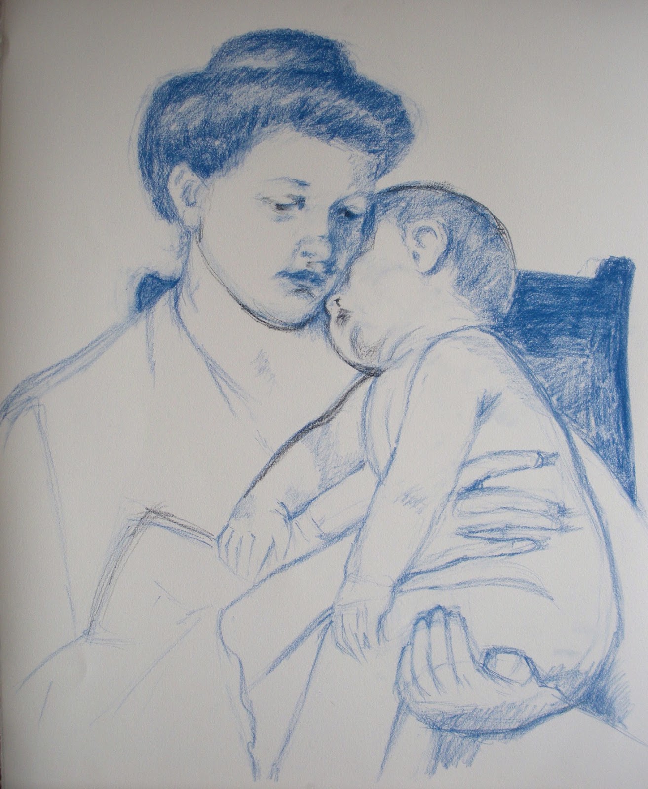


And the final together with the original. They are not fully identical: I swore to cut a finger of my left hand every time I trace (just joking...), so I always draw freehand. Of course it is possible to get identical copies also with freehand drawing, but it takes time and I thought it was not the point here. Needless to say, Mary's is better.
This is mine


This is Mary's 


When you copy a work of art is for the purpose of learning – so what did I learn? A few things:
  • The original has no hard edges anywhere. The center of focus is achieved by contrast and detail. The drawing is quite detailed and fine around the faces but it gets progressively rougher the farther from the faces it gets;
  • Mary was an impressionist. The richness of color in the shadows is what attracted me to the piece in the first place and it was a pleasure to follow through in the rich blues and reds. I liked very much the contrast between the warmish light and the cold bluish shadows.
  • The painting is extraordinaly high-key. I ended up using full white for big areas to get the same luminosity, shading it ever so slightly with yellow or blue.
  • The softness and delicacy in the rendering of the flesh tones and volumes is wonderful in this work – something really worth learning;
  • The work follows the Windmill principle. Here is the key: 1. Dark on light; 2. Light on light; 3. Light on dark; 4. Dark on dark


Tuesday, May 29, 2012

THE LITTLE BLUE BOAT

I have a little tin box full of self-imposed assignment descriptions - a medicine to keep momentum during the intersession! So there will be a steady trickle of posts of the most interesting ones - in the hope of some critique from the world out there. 
I had a single photo taken with my mobile camera of Nicolas sleeping in the grass on his yellow baby sling. What I liked about it was the high chroma shadows and the effects of transmitted light through the fabric, as well as the warm-cold contrasts. I thought it would make a great case study for transmitted light and chromatic reflected light. The composition also looked potentially interesting.


I made a small thumbnail first to study the value pattern and decide the edge treatment. The whole thing looked somewhat too horizontal, even for a quiet subject as this one, so I made two minuscule abstract studies and decided to make the patches of dabbled sunlight on the grass more diagonal (option 2).


I came to love pastels during the semester, and at the moment it is definitely the medium I know best, so that was the choice. I used Rives BFK paper with NuPastel, Rembrandt Pastel and the wonderfully soft but incredibly expensive Sennelier Pastels. I struggled with the color scheme a lot. I have learned that there cannot be three primaries in the same picture...the reference however looked like it had definitely some blue in the shadows on the left side, which together with the yellow and red of the right side would break the rule. Rules are there to be broken, but maybe not when you are just learning to deal with color! Much analysis later, I decided to experiment with Gurney's gamuts and picked one spanning  a high chroma red, medium chroma green and low chroma purple-red  - there are enough yellows in that one to handle the yellow fabric. Gamuts are devised for mixable media, but well, it is just a guideline. I recokened I could build the cool shadows from the purple red and the greens.So for the process, here is the charcoal underdrawing, fixed and toned (I forgot to take a picture before toning!)


Here is the first "wash" of pastel - a terrible stage when you start wondering wether the picture will work out at all...


And I think it did work out. I am quite happy with the result. The chromatic shadows and transmitted light worked out fine. The hands and folds around the head were intended as the focal point. I managed to defocus the legs and the background, I am not too sure about the bright lit fold on top. I fought with the legs a lot and I think they turned a bit muddy..maybe it was not a good idea to exclude the blues from the palette. There is one blue element, of course - guessed which one? 


The Little Blue Boat
Pastel on paper - 40x60cm (16.5"x25.5")


Pastel in my hands always seem to come out with this rich texture and gaudy brilliance that reminds me of a huge ice-cream cup with tons of smarties, cookies, cream and chocolate sauce. Maybe it is a bit too garish, but well, I will learn to tune it down one day - or maybe not! And did I mention I love drapery?