Tuesday, July 31, 2012

PRIVATE RENAISSANCE


This was by far the most complex and time-consuming piece I have ever done. Part of the problem was that I only had less than 2 hours of studio time per day in the past weeks (sometimes no studio time at all), so the whole thing stretched for almost a month and, as I guess is normal in such cases, it lost a bit of momentum. If I had had 10 hours per day to work on it it would not have been more than a week's work.
Isabella in the Kingdom of Love by Lorenzo Costa, 1504-1506
Originally, it was just supposed to be a study of drapery from a drawing featuring Isabella d’Este (a copy from a painting by Lorenzo Costa the Elder called “Isabella d’Este in the Kingdom of Love” - an allegory of Isabella’s coronation. I have never seen the original, although it is in the Louvre - I only had a relatively ugly drawing to work with). I had so much fun drawing that (and modifying the ugly face and hands of the original), that I went on and made another study of a Florentine woman of the same period from the same book (a history of costume). I put the two drawings one beside the other...and suddenly it seemed they belonged together and deserved a background as well. So I joined the sheets, collected reference of arcs, roses, gardens, a bas-relief from a church in Angers, etc... and gave them a context. 


The charcoal under-drawing looked good enough to go on, so I made a digital color study. At this point I wanted a quietly controlled, high renaissance flavor, so I browsed through a book about Raphael and aimed for the same limited color palette and feeling of diffused light. I built the picture in shades and tones of red and yellow only (some shades of green, purple and orange were thrown in as well), starting with the background, then the arch, then the faces. 

Digital color study
Work in progress, with all references laid out

I have a book about wrought iron-work that I collected from a public bookshelf, so I used some reference from that to build a iron gate behind the figures (I used the tracer for that). The figures were built last, so that I could pay attention to all edges.
The finished work with a digitally added background
Although it has cost me much more work that I anticipated, I am very happy with the result, especially if I compare the faces of the original with the ones I painted - without reference! Drapery is a fancy of mine, so I really enjoyed doing that and I think it turned out fine: velvet and linen and gold are quite believable. I also like the composition, although it seems maybe to lack a focus.


The original thoughts about the title were about a “Secret Garden”, “The Garden of the Heart” or something along those lines. Towards the end I realized it could make a perfect cover for a wonderful book by Maria Bellonci that I read a while ago: “Rinascimento Privato” - literally “Private Renaissance”. It is half historical novel, half documentary book and is written in the first person by the voice of ...Isabella d’Este! It could not be more fitting...just dreaming up a bit. This piece will definitely make it into my budding portfolio.
It is about time it was finished: I now have only five days left for my second GLA assignment  - for which I could secure the perfect model!

Friday, July 6, 2012

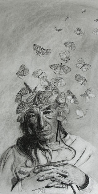
AUGUSTE DETER - A PORTRAIT OF ALZHEIMER DISEASE

Auguste Deter was 55 years old when she died in 1906 in an institute for mentally ill in Frankfurt. Alois Alzheimer, who had been her doctor there, examined her brain after her death, discovering the typical fibrils, plaques and tangles as well as brain atrophy, that have become to be regarded as the clearest diagnostic sign of Alzheimer's disease. These findings were not new, but for a coincidence of events, the already well-described disease became to be known with the name of Auguste's doctor, and her name will be forever remembered as the first person diagnosed with Alzheimer's disease, although this is actually not true: she was merely the youngest.
I find the idea of loosing one's identity and memory the most terrible nightmare that could occur in a person's life. Auguste had found the perfect description for that: "I have lost myself" she said repeatedly. These words and the haunting photograph of her in the year of her death have triggered an image in my head and I had to get it out. I had just got to know the work of the artist Dragan Bibin, so maybe the moths came from that corner of my memory. 

It's a study in charcoal on standard charcoal paper (a bit too rough for my taste, but I have 25 sheet of it, so I should use it somehow). Maybe one day I will make a painting of it. 

Sunday, July 1, 2012

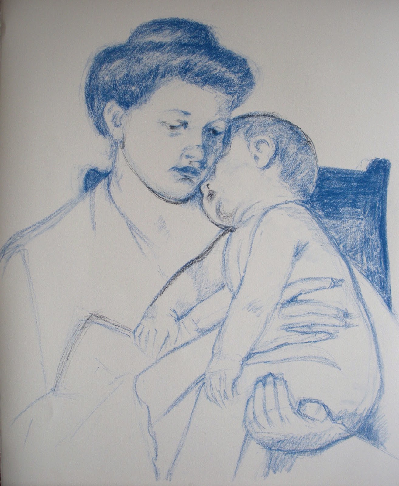
MARY CASSATT: "SLEEPY BABY"


In the 18th and 19th Century, it was common practice during the study of Arts in European Academies to copy masterpieces of other artists as part of the learning experience. The Louvre museum even issued special permissions to selected students, who were allowed to set up easel and work in the museum rooms. Just think of getting into a museum today with your easel, palette, turpentine and tubes of color and set up shop in front of – say – a Rembrandt painting. You would probably get arrested…
Anyhow, I have a couple of such “copying” assignments in my assignment box, directed mainly at pastel work. For this one, I set out to copy one of Mary Cassatt’s wonderful mother-and-child paintings, called “Sleepy Baby”, painted in 1910. I did it exactly as big as the original, 20.5 x 25.5 inches on Rives paper – though of course I worked from a photo and I have no idea which paper Mary used.

From the technical perspective, I faced a number of difficulties. One major one was to match the colors of the painting. I do not have enough Sennelier pastels to go even close to the wished colors and even my 96 NuPastel set fell short – plus Mary evidently used softer pastel. I tried my best, but you can see clear differences anyhow. According to Mr Maughan, she probably used blue or sanguine pastel rather than charcoal to do the drawing and either did not tone the paper or used a very light tone.  I used blue pastel for drawing, but I do think that Mary used charcoal: there are black lines visible in a couple of places. The color I chose for the toning was definitely wrong – on working on the piece I realized Mary probably toned either with a very light cold blue or with different colors in different areas. I think the latter is the approach I will follow in my next own pastel work, after establishing the value structure in charcoal.
Here is the process shots:


And the final together with the original. They are not fully identical: I swore to cut a finger of my left hand every time I trace (just joking...), so I always draw freehand. Of course it is possible to get identical copies also with freehand drawing, but it takes time and I thought it was not the point here. Needless to say, Mary's is better.
This is mine


This is Mary's 


When you copy a work of art is for the purpose of learning – so what did I learn? A few things:
  • The original has no hard edges anywhere. The center of focus is achieved by contrast and detail. The drawing is quite detailed and fine around the faces but it gets progressively rougher the farther from the faces it gets;
  • Mary was an impressionist. The richness of color in the shadows is what attracted me to the piece in the first place and it was a pleasure to follow through in the rich blues and reds. I liked very much the contrast between the warmish light and the cold bluish shadows.
  • The painting is extraordinaly high-key. I ended up using full white for big areas to get the same luminosity, shading it ever so slightly with yellow or blue.
  • The softness and delicacy in the rendering of the flesh tones and volumes is wonderful in this work – something really worth learning;
  • The work follows the Windmill principle. Here is the key: 1. Dark on light; 2. Light on light; 3. Light on dark; 4. Dark on dark


Tuesday, June 19, 2012

HEAD DRAWING - FA 602

The other studio course I followed this spring is a Fine Arts course: Head Drawing, with the famous William Maughan. I have found mention of his course and his book - "The Artist's Complete Guide to Drawing the Head" throughout the internet, generally with enthusiastic praise - which I can now confirm to be well deserved. As it was the case last semester with the Chiaroscuro course, the principles he teaches are very simple to grasp....and very hard to apply. In essence the key is to concentrate on the shapes of the shadows, their size and relative positions. Forget about features, forget about outlines, just get the shape and size and position of the shadows right and you will get the gender, age, race and likeness of the sitter. The second key learning is edge treatment. Paying a lot of attention to which edges should be hard and which should be soft, which are well defined and which are "lost" to value similarity boosts drawing technique to a totally different level. 
When you have small children, you suddenly notice how many small children are in the world around you. Your surroundings suddenly seem to teem with children, whom you had never noticed before. In the same way, when you finally understand a key concept you see it written everywhere: even in books that you have read already twice without ever noticing it. This happened to me with edge treatment. It is a key concept for analyzing artwork and for creating effective composition and now that I know what is meant with it I find it everywhere.

We used sanguine and white pastel on toned paper for the drawings. Carbothello 645 is the one he recommends: I used Faber Castell 192 at the beginning, but I ended up ordering Carbothello through the internet because it is way softer than Faber Castell. Any middle value paper is ok with this combination - if you want to go darker it takes a darker paper, as mentioned in a previous post. It takes some time to get used to the capped value range (sanguine simply does not go as dark as charcoal!), but the results are really nice and elegant.


This technique is very close to painting, and indeed he carried me through to my first real "painting" experience, using pastels as a medium.  He was also the one to introduce the Sennelier pastels for painting, which have a wonderful soft consistence and are well worth their price. Now that I am using them also for private work I am seriously considering to order a bigger range of colors, although they cost about 5 dollars each in this part of the world - for the moment I am complementing my modest set with NuPastel and Rembrandt pastel. Last but not least he introduced the technique known as "painture a l'essence" - which led me to squeeze my very first oil tubes onto a palette! I cannot say I liked the experience but it was a good way to loose the respect for the oils somehow.


Peinture a l'essence


That is basically the essence of the course...and yet, it has had a tremendous impact on my drawing skills. First of all, my heads now look like the people I am trying to draw: a very satisfying achievement. Second, this technique is actually applicable to any subject with the same effect - you get a drawing that is closer to a painting than to a cartoon. 

Tuesday, June 12, 2012

DIGITAL FEATURES


I am not proud of this week's results...actually I think they are plain awful. But, as Ira Glass said, this is a normal part of learning and I will not hide it. The brief called for doing a digital painting tutorial of my choice. I chose to do human features according to the wonderful tutorials published by 3D total in their great "Digital Painting Techniques" books. The tutorials I picked are from Anne Pagoda and Nykolai Aleksander, two great digital artists (particularly the latter). Why do I want to do such things? Together with self-imposed assignments I have a number of self-imposed goals. One of them reads something like:

"Thou shall master all media"

It is not that I expect to be able to really master all media but I do want to feel halfway comfortable in all of them. My style (whatever that may be) should be dominated by content not by media. And digital painting is a medium, nothing more, nothing less - and a very powerful one on top. There are actually people out there doing work so awesome with the computer that you feel like you will need three lifes to ever get even close to their level. Check this summary:


So here they are: eyes, mouths, ears and noses - not really like they were intended in the tutorials, I am afraid. I am used to draw with the tablet in Photoshop and that is ok...but painting is another matter altogether. It seems I am nowhere close to understand how the brushes work, there are way too many options to adjust: it feels like you have to change settings every two seconds to get where you want. Towards the end I had the feeling it is almost like learning to use the airbrush (which I have never learnt to use properly, tough I can do decent work) - it is just a matter of coordinating flow, pressure and sweep. Probably not a lot more complex than learning to drive a car or ride a bike....so here is my first fall from that bike. I think there will be many more before I will manage to handle this.


Thursday, June 7, 2012

THE PORTABLE MAN

I struggled a lot with this piece and it was incredibly frustrating. It was intended as a first experiment in digital photo-collage, but after three hours of work I realized I would never get where I wanted with the photos I had. While I was thinking when and where to schedule another photo session, I said to myself: I want to be an illustrator, not a photographer - so draw the stupid thing. Up to the initial sketch all went fine, then I had the brilliant idea to experiment with vectors...Ok, I realize it is not impossible to learn how to deal with them, but after the first attempts I estimated this would take the best part of my next five to ten studio slots. I know this is important and I will have to learn it at some point, but maybe that is not what I want to do right now. So I re-rasterized everything and went on from that.
It did not turn out as planned, although I do not dislike it...and I still like the concept, so maybe I will do another version one day. 
The big blank area is intended for lettering - I want to use this as an imaginary book cover for an imaginary book which somebody should bother to write entitled: "Managing Men: A Guide for Women".

The Portable Man - Digital

Friday, June 1, 2012

ETHNIC HEAD STUDIES

The brief for this self-imposed assignment read: "At least four monochromatic studies of ethnic heads (inuit, aborigine, maori, etc..). Dry media on toned paper." I cannot use them for portfolio or anything because I do not own the reference photos, but I hope it will be forgiven if I post them only once here. These studies are A4 sized and very fast to do, about 1h each or less. As soon as I started looking for reference I realized the scope of this training exercise: age, sex, race, expression, characterization....One could go on for a lifetime!


Classical sanguine and white pastel. Raatiraore (on the left) from Tahiti is one of the people interviewed in the fantastic book "Six Billion Others", which I warmly recommend to anyone interested in faces, people or the human race in general. The text below is an extract from his interview.


This are experiments with dark grey and white PanPastel. I liked the result, especially in the rendering of fur, so I did two of them.
   

These two ladies from Haiti did not really fit the brief (I know there is another assignment in the box that would fit them better), but I liked their expression. I do not think they turned out very well, especially because both had a difficult lighting and the color of the paper is wrong. I was taught that with monochromatic drawing on toned paper, the value of the paper should be halfway between your darkest dark and your lightest light. In both of these the paper is too light for the color scheme used.